Descriptive Statistics1 refers to a branch of statistics that involves the analysis, interpretation, and presentation of data in a concise and meaningful manner. Its primary objective is to describe and summarize the main characteristics and patterns present within a dataset. Descriptive statistics provides tools and techniques to organize, analyze, and present data, allowing for a better understanding of its key features.
Commonly used measures in descriptive statistics include measures of central tendency, such as the mean, median, and mode, which provide information about the typical or representative value of a dataset. Measures of dispersion, such as the range, variance, and standard deviation, describe the spread or variability of the data points. Other descriptive statistics techniques include frequency distributions, percentiles, quartiles, and graphical representations like histograms, box plots, and scatter plots.
Descriptive statistics is often the first step in data analysis, helping to identify patterns, trends, outliers, and the overall shape of the data distribution. It provides a basis for further exploration, comparison, and decision-making, aiding researchers, analysts, and decision-makers in summarizing and understanding the data at hand.
6.1 How data is distributed.
6.1.1 Quartiles, Deciles and Percentiles
Deciles, Percentiles and quartiles are crucial measures for understanding the distribution of data because they provide insights into the spread and central tendency of the data, which are not always apparent from measures like mean and standard deviation alone. Here’s why they are important:
Understanding Data Spread and Positioning: Deciles, Percentiles and quartiles divide the data into sections, showing the spread and distribution. For example, the 25th percentile (or first quartile) is the value below which 25% of the data falls, and the 75th percentile (or third quartile) is the value below which 75% of the data falls. This helps in understanding how data is spread across the range.
Identifying Central Tendency: The 50th percentile, also known as the median, is a measure of central tendency that divides the dataset into two equal halves. The median is less affected by outliers and skewed data compared to the mean, providing a more robust measure of the ‘center’ of the data.
Detecting Skewness and Outliers: By comparing quartiles and percentiles, one can infer the skewness of the distribution. For instance, if the distance between the first quartile and the median is significantly different from the distance between the median and the third quartile, the distribution may be skewed. Additionally, comparing the extreme values to the quartiles can help identify outliers.
Useful in Non-Normal Distributions: In distributions that are not normal or when the mean and standard deviation are not adequate to describe the data (like in skewed distributions), percentiles and quartiles provide more meaningful insights into the data’s characteristics.
Facilitating Comparison Between Datasets: Percentiles and quartiles allow for the comparison of different datasets on a common scale, even when the datasets have different means and spreads. This is particularly useful in fields like medicine or education where you might want to compare individual scores or results to a broader population.
Informing Decision Making: In many practical scenarios, decisions are based on these statistics. For example, in education, the 25th and 75th percentiles are often used by colleges to describe their admitted class. In economics, quartiles are used to understand income distribution in a population.
In summary, percentiles and quartiles offer a detailed and nuanced view of the data, providing a deeper understanding of its distribution, which is essential for accurate analysis, comparison, and decision-making.
Note: The Type 2 algorithm used in R’s quantile function closely resembles the method typically employed in manual calculations of quantiles. This algorithm calculates quantiles by averaging at discontinuities, which aligns with a common approach used in hand calculations. Specifically, when a quantile position falls between two data points, Type 2 takes the average of these points to determine the quantile value. This method is intuitive and often mirrors the process one might naturally follow when calculating quantiles without the aid of software, especially in situations where the dataset has an even number of observations and the median or another quantile must be interpolated. In R, the default method for the quantile function is Type 7. For detailed information on Type 7 and other methods (Types 1-9), consult R’s documentation by entering ?quantile in the console. This will bring up the help page, providing insights and guidelines for each quantile calculation method.
Context: You are analyzing the performance of two sales teams over a quarter. To understand their performance distribution, you have collected the weekly sales figures (in thousands of dollars) for each team.
Question: Using the concept of quantiles or percentiles, compare the performance of Team A and Team B. Specifically, calculate and analyze the quartiles (Q1, Q2, Q3) for each team’s weekly sales figures to see how their performances differ. Are there significant differences in their sales distributions, especially in terms of the lower quartile (Q1), median (Q2), and upper quartile (Q3)?
# Team A's Sales Figuresteam_A <-c(50, 55, 53, 54, 60, 62, 58, 59, 57, 61, 56, 52, 51)# Team B's Sales Figuresteam_B <-c(45, 46, 48, 49, 47, 50, 52, 51, 53, 54, 55, 43, 44)# Calculating Quartiles for Team Aquartiles_A <-quantile(team_A, probs =c(0.25, 0.5, 0.75))cat("Quartiles for Team A:\n", quartiles_A, "\n\n")
Quartiles for Team A:
 53 56 59
# Calculating Quartiles for Team Bquartiles_B <-quantile(team_B, probs =c(0.25, 0.5, 0.75))cat("Quartiles for Team B:\n", quartiles_B, "\n")
Quartiles for Team B:
 46 49 52
Lower Quartile (Q1): This quartile represents the sales figure below which 25% of the weeks fall. If Team A’s Q1 is higher, it indicates that their lowest 25% of sales figures are generally higher than those of Team B. This suggests greater consistency in achieving higher sales figures at the lower end of their range.
Median (Q2): The median provides insight into the typical weekly sales performance of each team. A higher median for Team A implies that their central tendency of sales is better, meaning that in a typical week, Team A tends to have higher sales than Team B.
Upper Quartile (Q3): This quartile indicates the sales figure below which 75% of the weeks fall. If Team A’s Q3 is higher, it suggests that they have more weeks with relatively higher sales figures, demonstrating stronger performance in the upper portion of their sales range.
While Team A shows higher figures in Q1, Q2, and Q3, suggesting overall stronger sales performance, the decision on incentives like bonuses should ideally consider additional factors as well, such as market conditions, team size, sales targets, and other KPIs.
  The decimal point is 1 digit(s) to the right of the |

  4 | 589
  5 | 245678
  6 | 01235678
  7 | 0123568
  8 | 012356789
  9 | 012358
This stem-and-leaf plot visualizes the distribution of pre-assessment test scores in Dr. Valderrama’s calculus class, comprising 40 students and an average score of 55. The plot reveals a bimodal distribution, indicating two distinct groups of students based on their test performance. One group is centered around a grade equivalent to a ‘D’, suggesting a cluster of lower scores. The other group is centered around a ‘B’ grade, indicating a cluster of higher scores. This bimodal pattern is a typical observation in ORU math classes, reflecting a significant variance in the students’ readiness and understanding of calculus concepts prior to the course. The plot effectively highlights these distinct performance clusters, offering valuable insights for targeted teaching strategies.
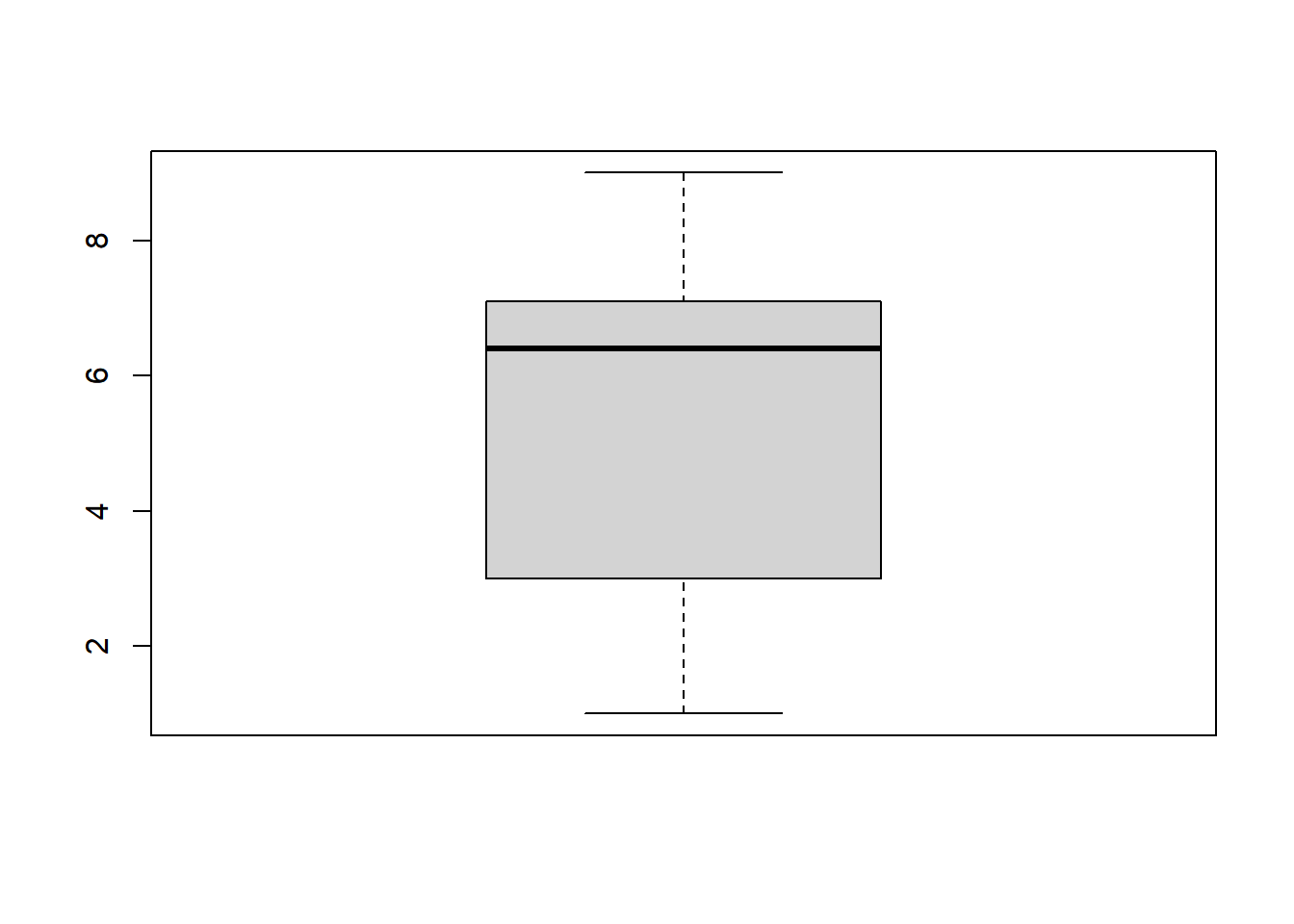
   Min. 1st Qu.  Median    Mean 3rd Qu.    Max.
   1.00    3.00    6.40    5.29    7.05    9.00
To create a simple boxplot, you can use the boxplot() function:
boxplot(data)
The boxplot shows the following characteristics:
The median (Q2) is represented by the line inside the box, which is around 6.4.
The box represents the interquartile range (IQR) and spans from the first quartile (Q1) at 3 to the third quartile (Q3) at 7.
The whiskers extend from the minimum value of 1 to the maximum value of 9.
There are no significant outliers.
The distribution of the data appears to be slightly right-skewed, as the median is closer to Q1 than to Q3, and there are more data points on the higher end of the scale. However, the skewness is not extreme, and the data is relatively concentrated between Q1 and Q3.
In summary, this dataset shows a moderate positive skewness with a concentration of values around the median, suggesting a distribution that is somewhat right-skewed but not highly so.
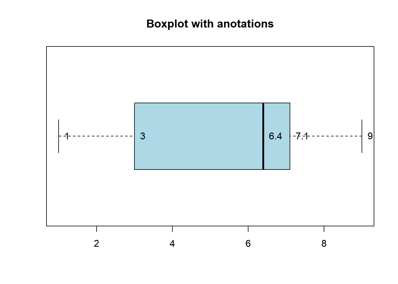
Better boxplot:
# Create a horizontal boxplotboxplot(data, horizontal =TRUE, col ="lightblue", main ="Boxplot with anotations")# Add summary statisticssummary_stats <-boxplot.stats(data)text(summary_stats$stats, 1, labels =round(summary_stats$stats, 2), pos =4)
Note:
In the previous plot, boxplot.stats(data) is used to calculate summary statistics for the dataset data. This function computes key statistics commonly displayed in a boxplot, including:
stats: The five-number summary, which includes minimum, Q1 (first quartile), median (Q2), Q3 (third quartile), and maximum.
n: The number of data points.
conf: The upper and lower bounds of the notches, indicating a confidence interval for the median.
To access these values using the dollar sign ($), you can do the following:
summary_stats$stats provides the five-number summary.
summary_stats$n gives you the number of data points.
summary_stats$conf returns the confidence interval for the median.
For example, summary_stats$stats would allow you to access the minimum, Q1, median, Q3, and maximum values calculated for your dataset.
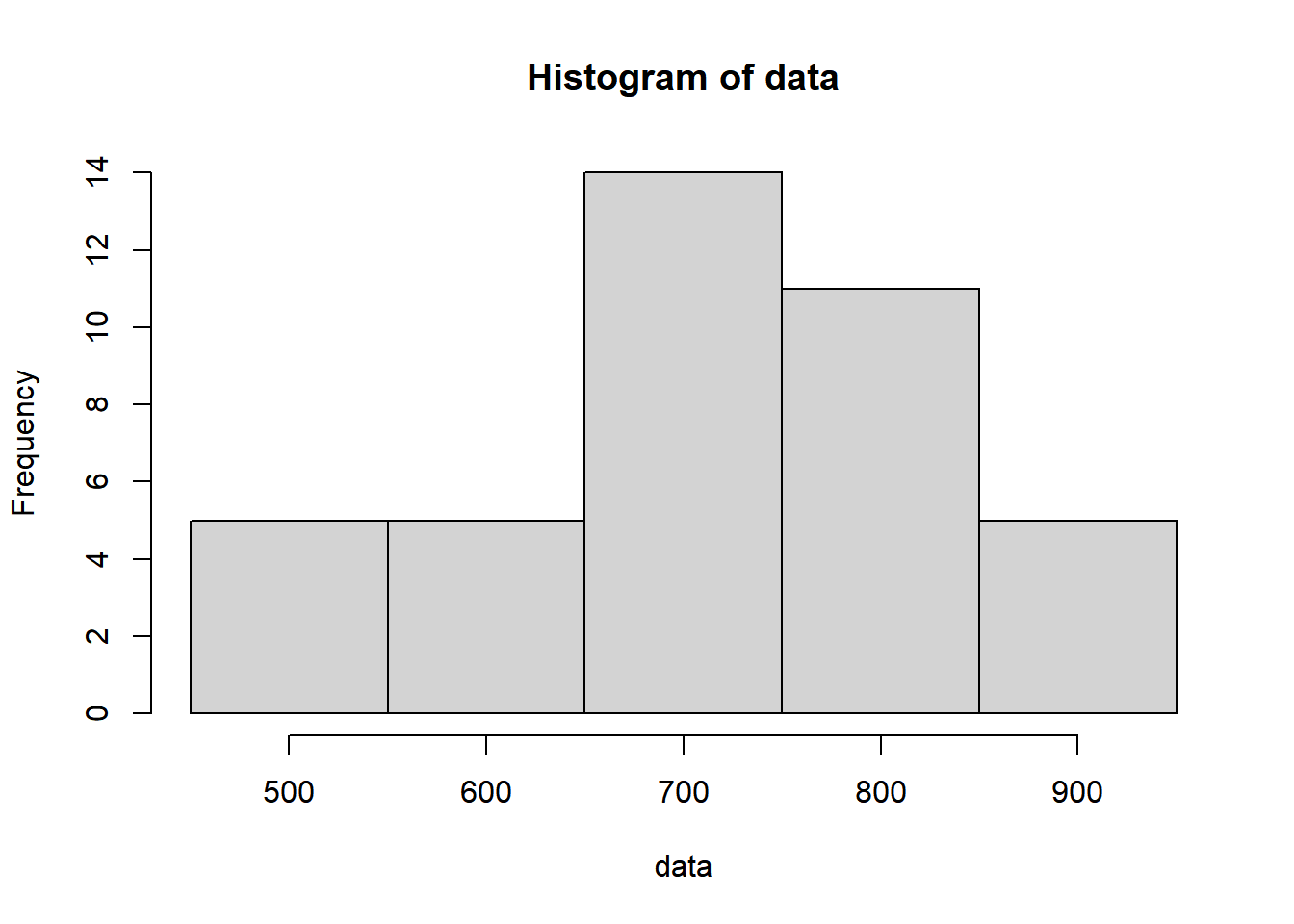
Using the provided dataset, create a frequency table divided into 5 classes. Calculate the mean from this frequency table and generate a corresponding histogram based on the data.
To establish the intervals for our frequency table, it’s essential to determine the minimum and maximum values present in our dataset. While this might seem straightforward if the data is sorted, using R’s min() and max() functions makes this process equally simple and efficient.
Now, we can establish appropriate break points to create, for instance, 5 classes:
breaks <-seq(450, 950, by =100)
The hist() function in R also includes counts and breaks as attributes within the object it generates:
# Hist. with specif. breaks and type of interval: left close, right openhist_data <-hist(data, breaks = breaks, right =FALSE, plot =FALSE)# Extract breaks and counts from the histogrambreaks <- hist_data$breakscounts <- hist_data$counts# Display the frequency tablefrequency_table <-data.frame(midpoint =c(500,600,700,800,900),interval =paste0("[", breaks[1:5],", ", breaks[2:6],")"),Frequency = counts)print(frequency_table)
When calculating the mean directly from the raw data, each data point is given equal importance. However, in the frequency table method, the values are grouped into intervals, and each interval is represented by its midpoint. The frequencies are multiplied by these midpoints, and the resulting values contribute differently to the final mean based on the frequency of occurrence within each interval.
In essence, the frequency table method treats each interval’s midpoint as a representative value for the entire interval, whereas the direct calculation from the raw data considers each individual data point as equally significant in the calculation of the mean.
This distinction in treatment leads to slight differences in the resulting mean values between the two calculation methods, especially when the data distribution is not uniform across the intervals or when the frequency distribution is skewed.
Plot:
Finally we can plot:
hist(data, breaks = breaks, right =FALSE)
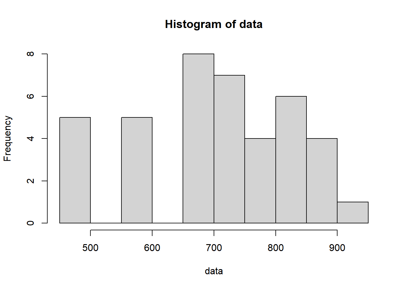
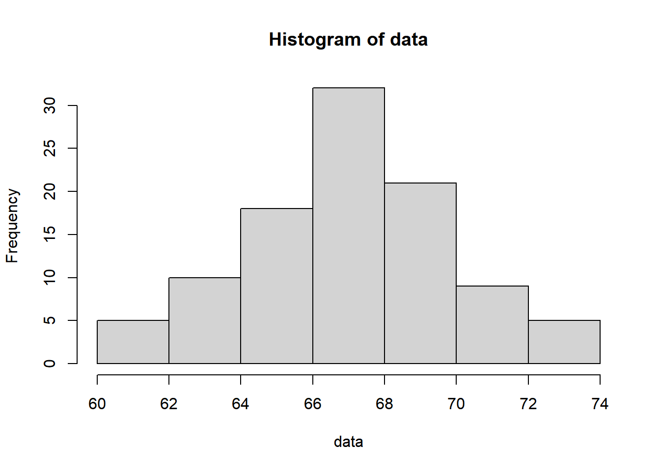
You can also compare these breakpoints with the default parameters of the hist() function:
hist(data)
Note: When using the hist() function, I utilize right = FALSE to specify the interval counting method. In this scenario, the left data point is included within the interval, while the right data point is excluded. When right = FALSE, the histogram cells represent closed on the left and open on the right intervals, denoted as [,) intervals.
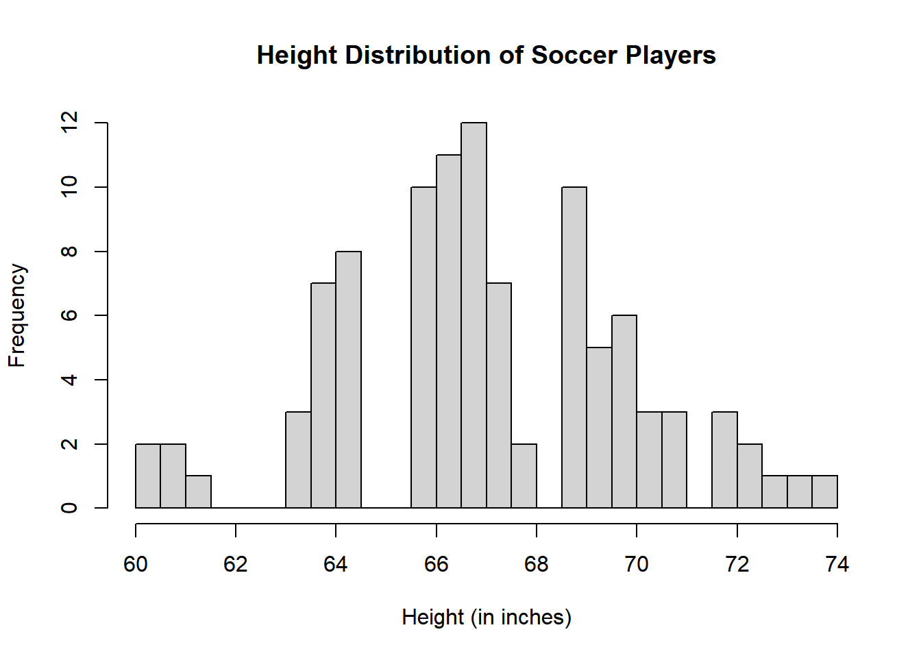
# Create a histogram with more binshist(data, breaks =20, main ="Height Distribution of Soccer Players", xlab ="Height (in inches)")
Discussion:
The histogram above displays the distribution of heights for 100 male semiprofessional soccer players. Here are some observations about the data distribution:
The distribution appears to be roughly bimodal, with two prominent peaks in the histogram. This suggests that there may be two distinct groups of players within the dataset, possibly representing different positions or characteristics.
The first peak is centered around the height of 66 inches, indicating a group of players with heights close to 66 inches.
The second peak is centered around the height of 69 inches, representing another group of players with heights close to 69 inches.
The data is not perfectly symmetric, and there is a slight right-skewness, with a longer tail on the right side of the distribution.
There are no significant outliers or extreme values in the dataset.
However, the interpretation of a bimodal distribution may not be entirely accurate, given the limited amount of data and the lack of a clear separation between the two peaks.
The histogram indicates that the data may have a more complex structure, with some players around 66 inches and another group around 69 inches, but there is also a range of heights in between. It’s possible that the “bimodal” appearance is due to the limited dataset, and with more data, the distribution could take on a different shape or reveal additional peaks.
In conclusion, it would be more appropriate to describe this dataset as having some concentration of heights around 66 inches and another concentration around 69 inches, but it doesn’t exhibit a clearly bimodal pattern. A larger dataset or more sophisticated statistical methods might be needed to draw more definitive conclusions about the distribution.
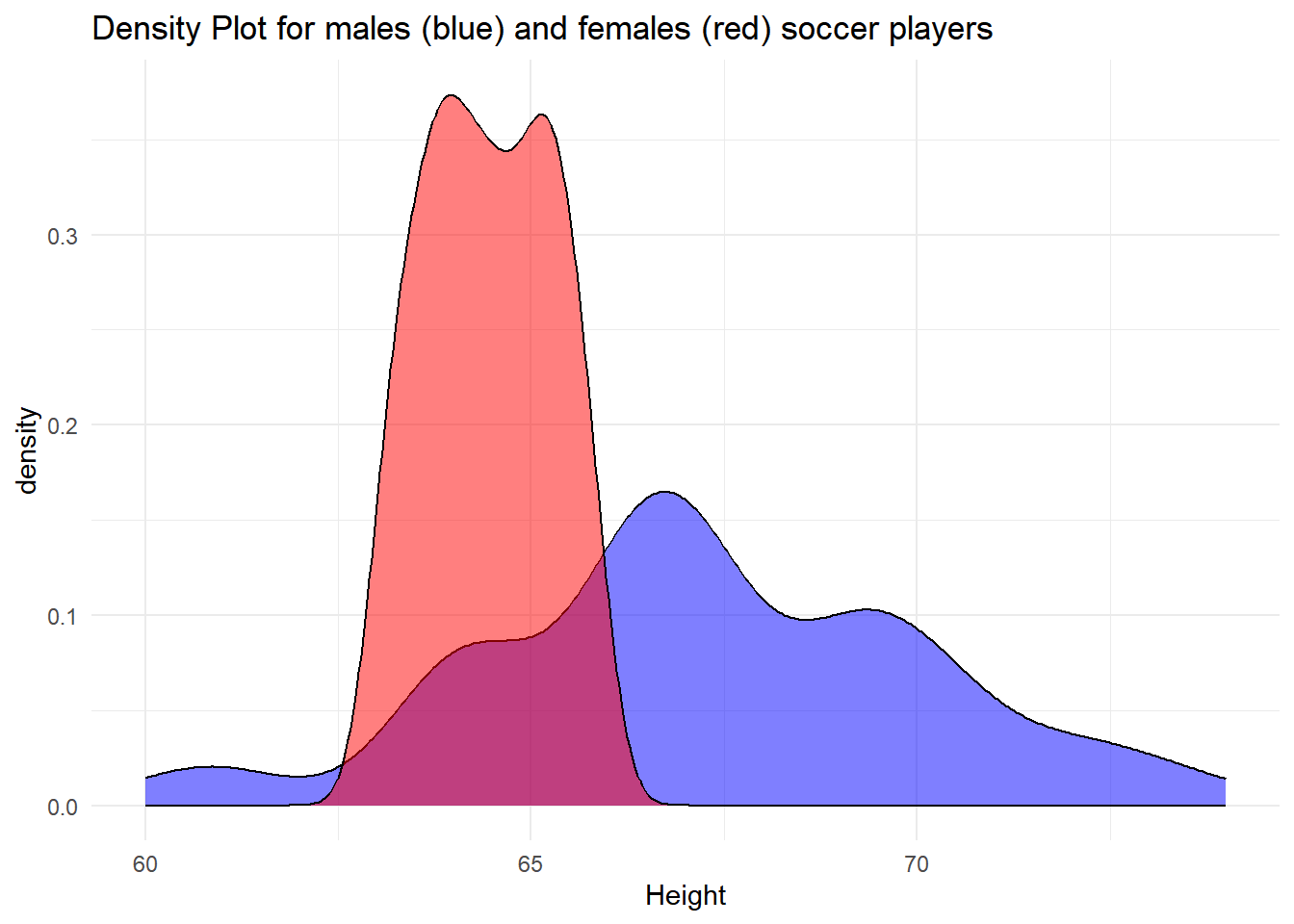
The data in the previous problem represent continuous data, as height measurements are typically continuous. Therefore, a density plot would be more suitable for visualization.
Please create a DataFrame with two columns: the first column should be named ‘m’ and contain the data from the previous problem, and the second column should be named ‘f’ and contain the following synthetic data:
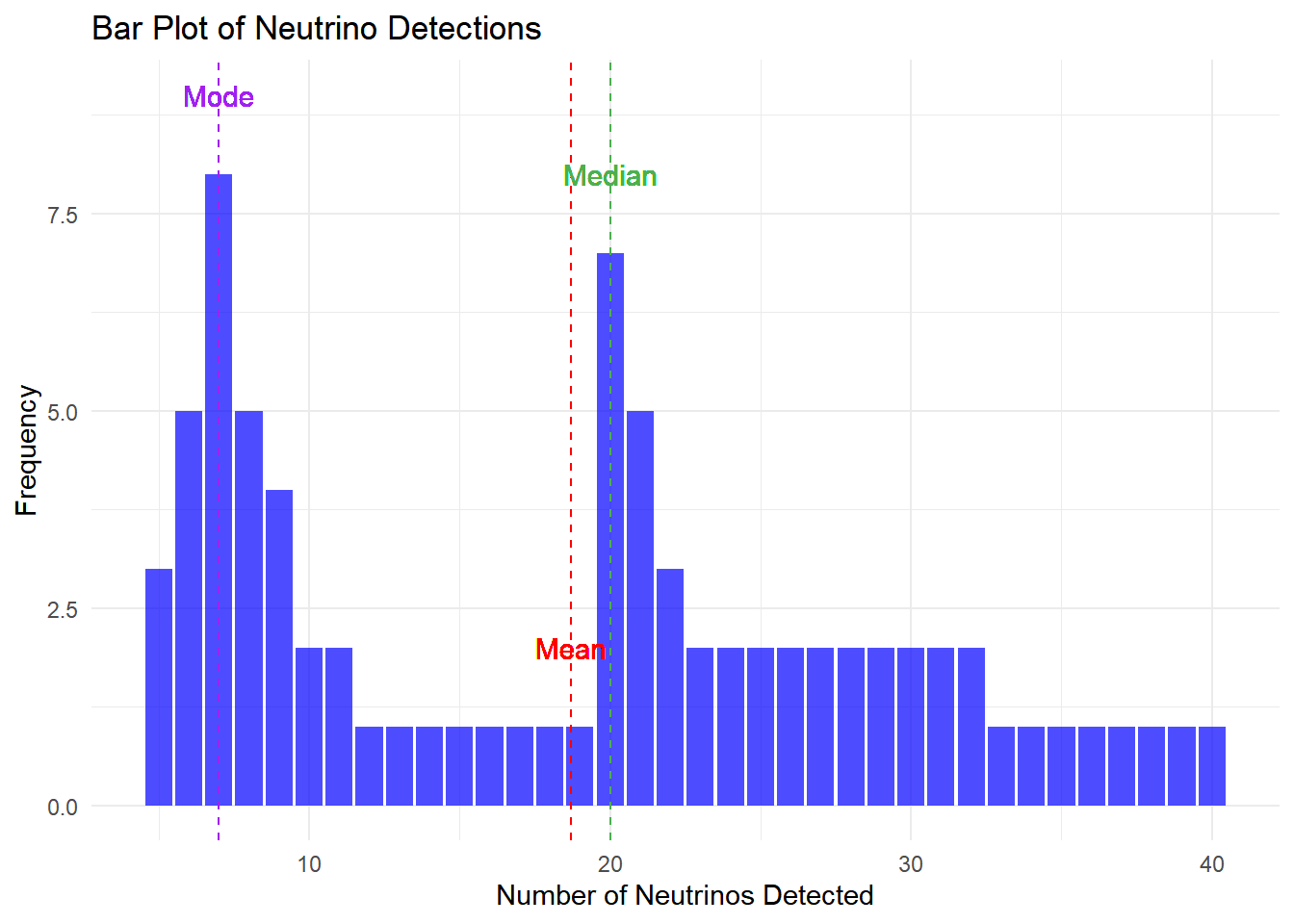
In a South Pole observatory, scientists have been monitoring the number of neutrinos detected over a period of time. They have collected a dataset of neutrino counts, which appears to be left-skewed. Neutrinos are fundamental particles that are notoriously difficult to detect due to their elusive nature.
The dataset contains 200 data points representing the number of neutrinos detected in the observatory. The data distribution is skewed to the left, resulting in differences between various measures of central tendencies. Your task is to analyze this dataset and answer the following questions:
Calculate the mean, median, and mode of the dataset.
Explain why the mean and median values are different in this skewed dataset.
Describe the significance of this observation in the context of neutrino detection.
Visualize the dataset using a bar plot with ggplot2. Add vertical lines and text to indicate the mean, median, and mode on the plot. What insights can you gain from the bar plot regarding the distribution of neutrino detections in the observatory?
Your answers should provide insights into the unique challenges and characteristics of neutrino detection, as well as the statistical properties of the given dataset. Additionally, you are required to create and interpret a bar plot using ggplot2 for a visual representation of the data distribution.
Warning in geom_text(aes(x = mean_value, y = table(neutrino_counts)[as.character(round(mean_value))] + : All aesthetics have length 1, but the data has 80 rows.
ℹ Please consider using `annotate()` or provide this layer with data containing
  a single row.
Warning in geom_text(aes(x = median_value, y = table(neutrino_counts)[as.character(round(median_value))] + : All aesthetics have length 1, but the data has 80 rows.
ℹ Please consider using `annotate()` or provide this layer with data containing
  a single row.
Warning in geom_text(aes(x = mode_value, y = table(neutrino_counts)[as.character(round(mode_value))] + : All aesthetics have length 1, but the data has 80 rows.
ℹ Please consider using `annotate()` or provide this layer with data containing
  a single row.
The mean, as the average value of the dataset, is impacted by the left skew in the data, being drawn towards lower values due to the substantial cluster on the left side. In contrast, the median, positioned at the middle of the ordered dataset, is less influenced by extreme values and provides a more robust measure of central tendency, especially in skewed datasets. In this scenario, the median surpassing the mean underscores the left skew in the distribution.
The significance of this left-skewed distribution in neutrino detection suggests that the majority of observations are concentrated on the lower end of the detection range. Notably, the mode, placed at the center of two distinct data groups, contributes to the characterization of this left skew.
Furthermore, the observation of a bimodal distribution implies the potential presence of two different sources of neutrino events. However, drawing definitive conclusions necessitates a more extensive dataset for a comprehensive analysis.
# (b) Perform the Shapiro-Wilk normality testshapiro.test(data)
    Shapiro-Wilk normality test

data:  data
W = 0.87827, p-value = 3.527e-06
Explanation and Discussion:
The QQ plot visually assesses the normality of the data. In the QQ plot, data points should closely follow the diagonal reference line. If they deviate from this line, it suggests non-normality.
The Shapiro-Wilk test is used to assess the normality of the data. The null hypothesis (\(H_0\)) for the test is that the data is normally distributed. The alternative hypothesis (\(H_1\)) is that the data is not normally distributed. The test returns a test statistic and a p-value.
The Shapiro-Wilk test results in a p-value. If the p-value is less than the chosen significance level (commonly 0.05), we reject the null hypothesis. In this case, the p-value is used to determine whether the data is significantly different from a normal distribution.
In our case, the p-value is the result of the Shapiro-Wilk test. If it is less than 0.05, we would reject the null hypothesis and conclude that the data is not normally distributed. If the p-value is greater than 0.05, we fail to reject the null hypothesis, indicating that the data can be considered as coming from a normal distribution.
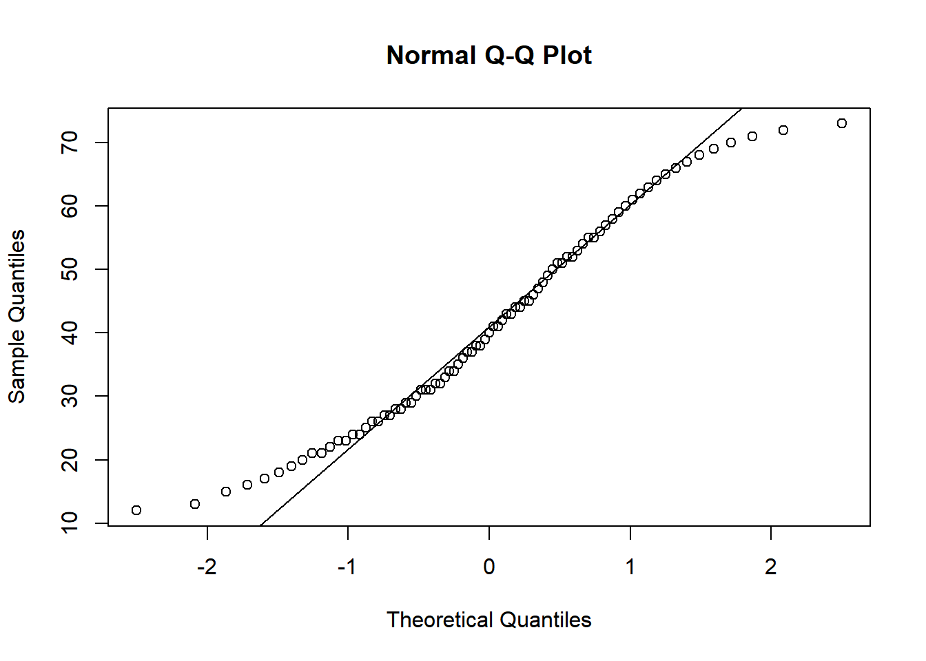
Based on the QQ plot and the Shapiro-Wilk test statistic, it can be concluded that the distribution of the scores does not align with a normal distribution.
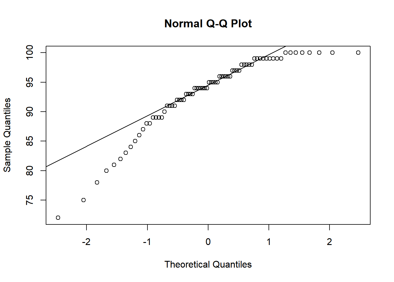
You are provided with a dataset of 80 data points representing the daily sales figures (in thousands of dollars) for a retail store over the last 80 days. The dataset is as follows:
Create a QQ plot: Using the provided dataset, create a QQ plot to visually assess the normality of the data. Provide a description of what you observe in the plot.
Perform the Shapiro-Wilk normality test: Apply the Shapiro-Wilk test to the dataset to check for normality. Report the test statistic and the p-value.
Interpret the Results: Discuss the implications of the test results and whether the data can be considered normally distributed based on the Shapiro-Wilk test.
# Step 2: Perform the Shapiro-Wilk normality test# Applying Shapiro-Wilk testshapiro_test <-shapiro.test(sales_data)# Displaying the test resultsprint(shapiro_test)
    Shapiro-Wilk normality test

data:  sales_data
W = 0.96639, p-value = 0.03178
# Step 3: Interpret the results
The Shapiro-Wilk test is used to assess the normality of a dataset. In hypothesis testing, we typically set a significance level (often denoted as \(\alpha\)) to decide whether to reject the null hypothesis. The most commonly used significance level is 0.05.
Null Hypothesis (H0): The data is normally distributed.
Alternative Hypothesis (H1): The data is not normally distributed.
In our case, the p-value is 0.032, which is less than the standard significance level of 0.05. When the p-value is less than the chosen alpha level, we reject the null hypothesis.
Therefore, based on the Shapiro-Wilk test with a p-value of 0.032, we would reject the null hypothesis and conclude that the sales data is not normally distributed. This suggests that the distribution of daily sales figures in the dataset deviates from a normal distribution.
The QQ plot reveals a noticeable curving at the tails of the data distribution. This curving indicates that the extreme values in the dataset deviate from what would be expected in a normal distribution. Such a pattern typically suggests the presence of heavier or lighter tails than a normal distribution. This observation, coupled with the Shapiro-Wilk test result (p-value of 0.032), strongly suggests that the data is not normally distributed. It may imply that additional factors or phenomena are influencing the extreme values in the sales data, warranting further investigation to understand these underlying causes
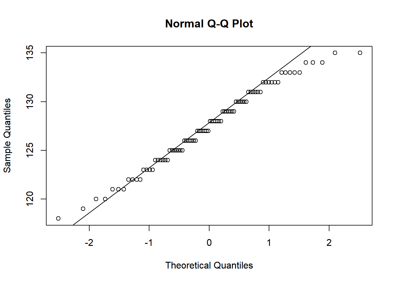
You are given a dataset of 80 data points representing the systolic blood pressure (in mmHg) of a group of healthy adults. The dataset is generated to follow a normal distribution closely:
Create a QQ plot: Use the provided dataset to create a QQ plot. This will visually assess the normality of the blood pressure data. Describe your observations from the plot.
Perform the Shapiro-Wilk normality test: Apply this test to the dataset to check for normality. Report the test statistic and the p-value.
Interpret the Results: Discuss the implications of the test results and conclude whether the blood pressure data can be considered normally distributed based on the Shapiro-Wilk test.
# Step 2: Perform the Shapiro-Wilk normality test# Applying Shapiro-Wilk testshapiro_test <-shapiro.test(bp_data)# Displaying the test resultsprint(shapiro_test)
    Shapiro-Wilk normality test

data:  bp_data
W = 0.98031, p-value = 0.2265
# Step 3: Interpret the results# The interpretation will depend on the p-value from the Shapiro-Wilk test.# Generally, if the p-value is greater than the chosen alpha level (e.g., 0.05),# the null hypothesis of normality is not rejected.
After closely examining the QQ plot, we observe that the data points align well with the reference line, suggesting that the dataset follows the expected trend of a normal distribution. This visual assessment is reinforced by the results of the Shapiro-Wilk normality test. With a p-value greater than 0.05, we do not have sufficient evidence to reject the null hypothesis, which states that the data is normally distributed. It’s important to note that failing to reject the null hypothesis is not equivalent to proving it true; rather, it indicates that there is not enough evidence to conclude that the data deviates from normality. Therefore, while we cannot definitively claim the data is normal based solely on this test, the results are consistent with the assumption of a normal distribution, supporting the perspective that the data likely comes from a normal distribution.
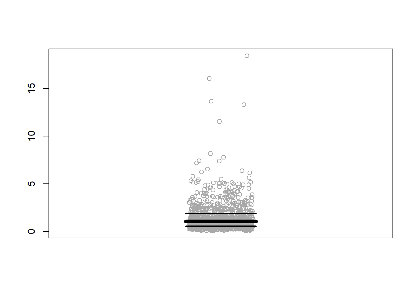
set.seed(0) # For reproducibility# Generating a right-skewed dataset using a log-normal distributiondata <-rlnorm(1000, meanlog =0, sdlog =1)# Inverting the values to make the dataset left-skewedleft_skewed_data <-1/ data# Plotting the data with jitterstripchart(left_skewed_data, method ="jitter", col="black", pch=1, vertical =TRUE)# Calculating median, first and third quartilesmedian_val <-median(left_skewed_data)first_quartile <-quantile(left_skewed_data, 0.25)third_quartile <-quantile(left_skewed_data, 0.75)# Adding lines for median, first and third quartilesabline(h = median_val, col ="red", lwd =2)abline(h = first_quartile, col ="blue", lwd =2)abline(h = third_quartile, col ="green", lwd =2)
set.seed(0) # For reproducibility# Generating a right-skewed dataset using a log-normal distributiondata <-rlnorm(1000, meanlog =0, sdlog =0.9)# Inverting the values to make the dataset left-skewedleft_skewed_data <-1/ data# Plotting the data with jitterstripchart(left_skewed_data, method ="jitter", col="darkgray", pch=1, vertical =TRUE)# Calculating median, first and third quartilesmedian_val <-median(left_skewed_data)first_quartile <-quantile(left_skewed_data, 0.25)third_quartile <-quantile(left_skewed_data, 0.75)# Getting range for x to set the width of segmentsx_range <-range(0.89, 1.11)# Adding segments for median, first and third quartilessegments(x0 = x_range[1], y0 = median_val, x1 = x_range[2], y1 = median_val, col ="black", lwd =6)segments(x0 = x_range[1], y0 = first_quartile, x1 = x_range[2], y1 = first_quartile, col ="black", lwd =2)segments(x0 = x_range[1], y0 = third_quartile, x1 = x_range[2], y1 = third_quartile, col ="black", lwd =2)
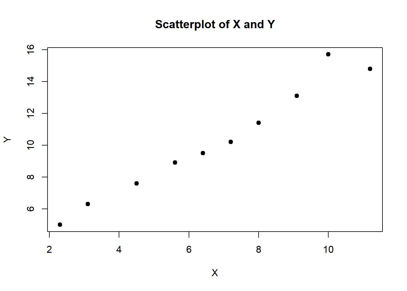
Context: You are a data science student tasked with investigating the relationship between two variables, X and Y, in a hypothetical scenario. Your goal is to visually assess the linear relationship between these variables, calculate the correlation strength, and perform a linear regression analysis using R.
Synthetic Data: Here are the synthetic data pairs for X and Y:
Data Visualization: First, create a scatterplot to visually check the linear relationship between X and Y. Use appropriate labels and titles to make your visualization clear and informative.
Correlation Strength: Calculate the correlation coefficient (Pearson’s r) to quantitatively assess the strength and direction of the linear relationship between X and Y. Comment on the result - is it a strong positive correlation, a weak correlation, or no correlation?
Linear Regression Analysis: Perform a linear regression analysis using R. You can use the lm() function in R to fit a linear model to the data. Calculate the linear coefficients for the intercept and the slope of the line.
P-values and Test Statistics: Examine the summary of the linear model using the summary() function in R. Discuss the p-values associated with the coefficients. Are they statistically significant? Also, consider the test statistics (t-values) for the coefficients.
Adjusted R^2: Calculate the adjusted R-squared and interpret its relationship with the percentage of the data that the model fits correctly.
Conclusion: Based on your analysis, draw a conclusion about the relationship between X and Y. Is there a statistically significant linear relationship between the two variables, and if so, what does it imply in the context of the problem?
Please provide your R code and interpretation for each step of the analysis in your response.
# Synthetic DataX <-c(2.3, 4.5, 3.1, 5.6, 7.2, 6.4, 8.0, 9.1, 11.2, 10.0)Y <-c(5.0, 7.6, 6.3, 8.9, 10.2, 9.5, 11.4, 13.1, 14.8, 15.7)# Task 1: Data Visualizationplot(X, Y, main="Scatterplot of X and Y", xlab="X", ylab="Y", pch=19)
if (abs(correlation_coefficient) >=0.7) {cat("There is a strong correlation between X and Y.\n")} elseif (abs(correlation_coefficient) >=0.3) {cat("There is a moderate correlation between X and Y.\n")} else {cat("There is a weak or no correlation between X and Y.\n")}
# Task 4: P-values and Test Statisticssummary_model <-summary(model)cat("\nSummary of Linear Model:\n")
Summary of Linear Model:
print(summary_model)
Call:
lm(formula = Y ~ X)

Residuals:
     Min       1Q   Median       3Q      Max
-0.73790 -0.34614  0.00371  0.04249  1.58486

Coefficients:
            Estimate Std. Error t value Pr(>|t|)
(Intercept)  2.25887    0.57053   3.959  0.00418 **
X            1.18563    0.07825  15.151 3.57e-07 ***
---
Signif. codes:  0 '***' 0.001 '**' 0.01 '*' 0.05 '.' 0.1 ' ' 1

Residual standard error: 0.6879 on 8 degrees of freedom
Multiple R-squared:  0.9663,    Adjusted R-squared:  0.9621
F-statistic: 229.6 on 1 and 8 DF,  p-value: 3.565e-07
# Task 5: Adjusted R-squared and Percentage of Data Fitadjusted_r_squared <- summary_model$adj.r.squaredcat("\nAdjusted R-squared (R² adjusted):", adjusted_r_squared, "\n")
Adjusted R-squared (R² adjusted): 0.9621148
percentage_fit <- adjusted_r_squared *100cat("The model fits approximately ", percentage_fit, "% of the data correctly.\n")
The model fits approximately 96.21148 % of the data correctly.
# Task 6: Conclusioncat("\nConclusion:\n")
Conclusion:
if (summary_model$coefficients[2, "Pr(>|t|)"] <0.05) {cat("The linear regression coefficient for X is statistically significant.\n")cat("There is a significant linear relationship between X and Y.\n")} else {cat("The linear regression coefficient for X is not statistically significant.\n")cat("There is no significant linear relationship between X and Y.\n")}
The linear regression coefficient for X is statistically significant.
There is a significant linear relationship between X and Y.
In this R script:
Task 1 creates a scatterplot to visualize the relationship between X and Y.
Task 2 calculates and prints the correlation coefficient (Pearson’s r) and comments on the strength of the correlation.
Task 3 performs linear regression analysis using the lm() function to obtain the coefficients of the linear model.
Task 4 summarizes the model and provides p-values and test statistics.
Task 5 calculates the adjusted R-squared and the percentage of data fit by the model. Adjusted R-squared is a measure of how well the independent variable (X) explains the variance in the dependent variable (Y), and it takes into account the number of predictors in the model. The percentage of data fit provides an intuitive way to understand the goodness of fit of the model, indicating how much of the variance in Y is explained by the model.
Task 6 draws a conclusion based on the statistical significance of the linear regression coefficient for X.
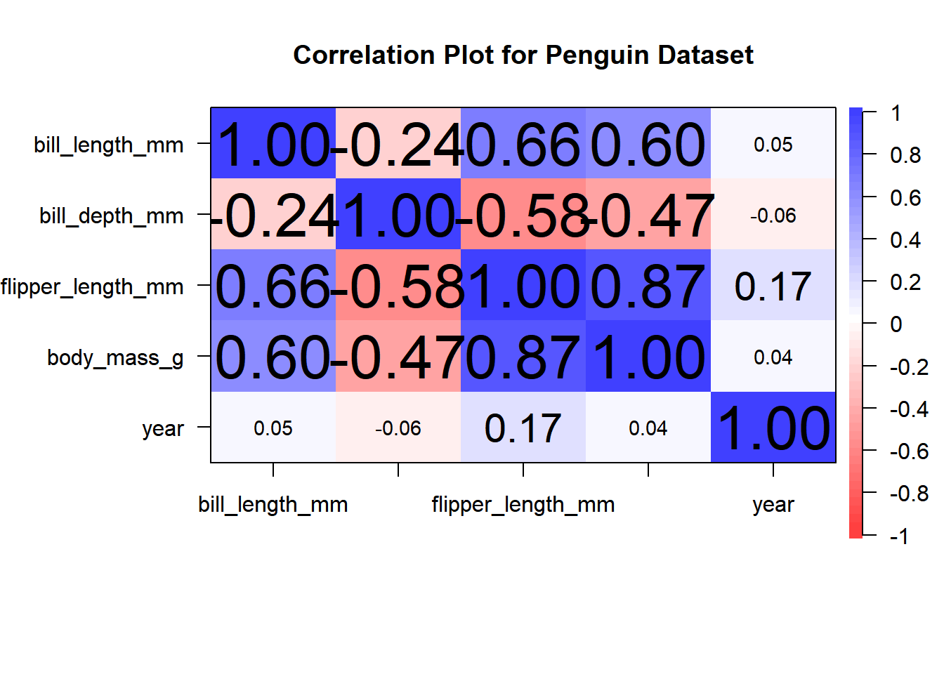
You are given a dataset named penguins, which is included in the palmerpenguins library. Your objective is to assess your data visualization and interpretation skills in R.
Create a correlation plot using the ‘corPlot’ function from the ‘psych’ library.
Utilize the ‘penguins’ dataset to generate this plot.
Instructions:
Load and install the required libraries and dataset:
# Load the required librarylibrary(psych)install.packages("palmerpenguins")library(palmerpenguins)
Subset dataset to only numeric variables
# Subset only numericnumeric_penguins <- penguins[, sapply(penguins, is.numeric)]
Create a correlation plot using the corPlot function:
# Create a correlation plot using only numeric variablescorPlot(numeric_penguins)
Interpret and discuss the results of the correlation plot:
What do the colors and shapes of the plot elements represent?
Examine the correlation coefficients and their values. Which variables are highly correlated, and which are not?
Based on the correlation plot, what relationships or associations can you observe between different variables in the penguin dataset?
Are there any unexpected or interesting findings in the correlation plot?
Note: The penguins dataset contains information about various penguin species, including their body measurements, flipper length, and bill dimensions. The correlation plot will help to explore relationships between these variables and identify potential patterns or trends.
# Load the required librarieslibrary(psych)#install.packages("palmerpenguins")library(palmerpenguins) # Subset only numericnumeric_penguins <- penguins[, sapply(penguins, is.numeric)]# Create a correlation plot using only numeric variablescorPlot(numeric_penguins, main ="Correlation Plot for Penguin Dataset",cex.labels =0.5)
Color Representation: In the correlation plot, colors are used to represent the magnitude of correlations between variables. Colors range from blue (negative correlation) to red (positive correlation).
Correlation Coefficients: Examine the correlation coefficients displayed in the plot. Variables that are closer to +1 or -1 have stronger correlations, while those closer to 0 have weaker correlations. Highly correlated variables are those with coefficients close to +1 or -1, while uncorrelated variables have coefficients close to 0. For example, body mass and flipper length have a strong positive correlation, while body mass and bill length have a moderate negative correlation.
Relationships and Associations: Based on the correlation plot, we can observe several relationships and associations between variables. For instance, there is a strong positive correlation between flipper length and body mass, suggesting that penguins with longer flippers tend to have higher body mass. On the other hand, there is a moderate negative correlation between body mass and bill length, indicating that penguins with heavier body mass tend to have shorter bills.
Interesting Findings: One interesting finding is the lack of a strong correlation between bill depth and bill length, which suggests that the dimensions of a penguin’s bill are not strongly related to each other. This can have implications for ecological and evolutionary studies of penguin species.
In summary, the correlation plot reveals significant relationships between various attributes of penguins in the dataset. Understanding these correlations is essential for data analysis and can help researchers and scientists gain insights into penguin biology and behavior.
6.3 Areas and Probabilities
6.3.0.1 Calculating and Visualizing Areas in a Normal Distribution:2
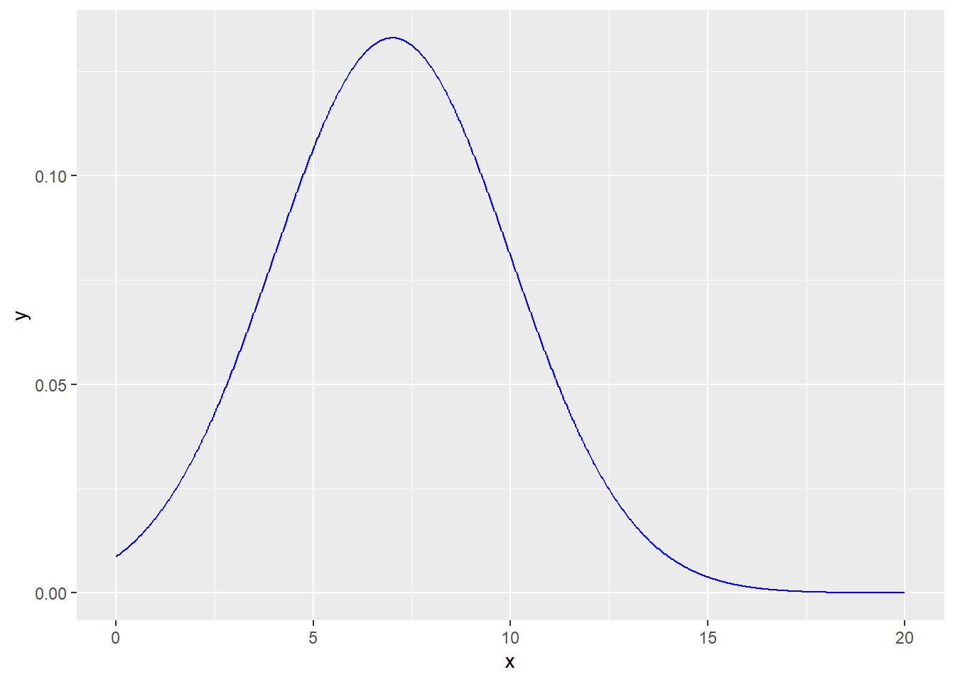
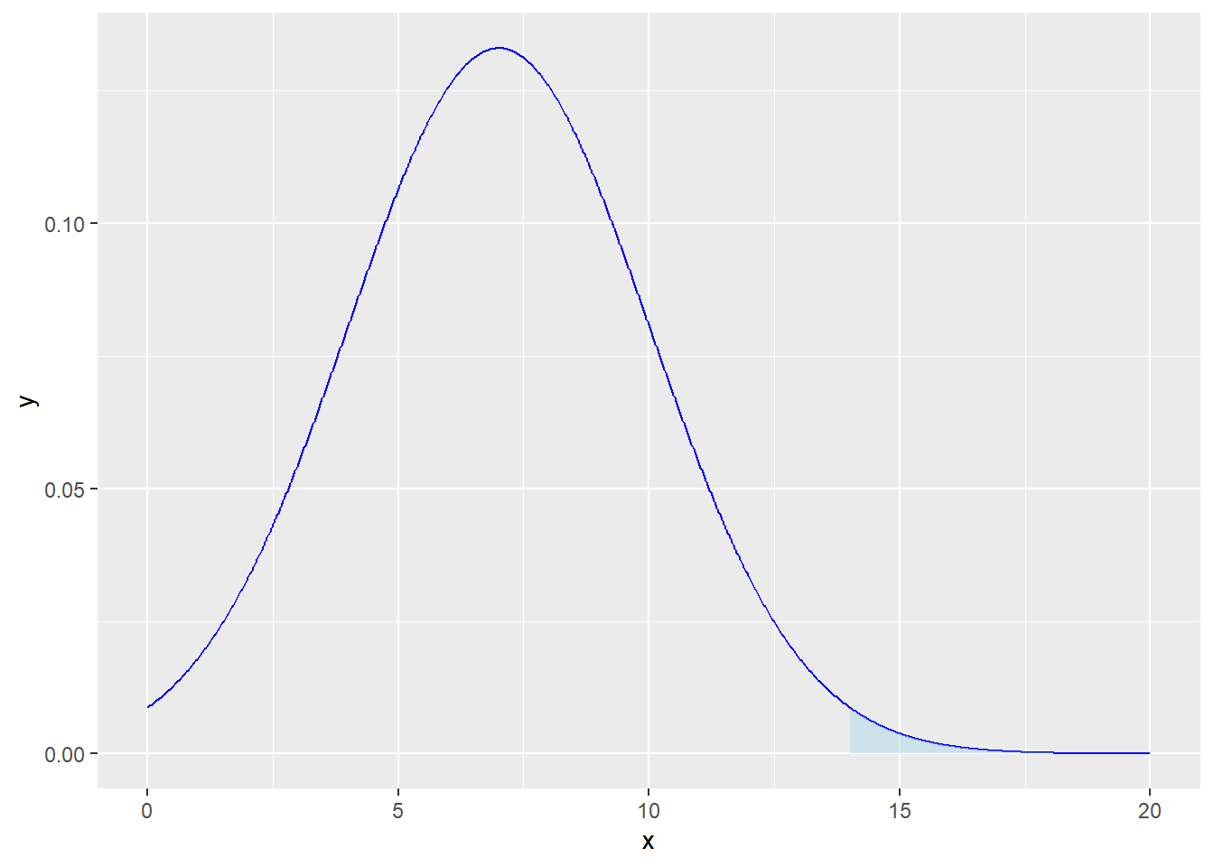
Suppose you have a normally distributed variable with a mean (\(\mu\)) of 7 and a standard deviation (\(\sigma\)) of 3. Your task is to calculate the probability of this variable exceeding a value of 14: \[P(x > 14)\]
Calculate \(P(x > 14)\) using the properties of the normal distribution.
Provide a visualization (plot) to illustrate the area under the curve that represents \(P(x > 14).\)
# Parameters for the normal distributionmu <-7sigma <-3# Calculate P(x > 14)p_x_greater_than_14 <-1-pnorm(14, mean = mu, sd = sigma)# ORp_x_greater_than_14 <-pnorm(14, mean = mu, sd = sigma, lower.tail =FALSE)p_x_greater_than_14
[1] 0.009815329
# Load the required librarylibrary(ggplot2)# Creating the vectors for the dataframex <-seq(0, 20, length =1000)y <-dnorm(x, mean = mu, sd = sigma)# Create the plot of the distributionp1 <-ggplot(data.frame(x, y), aes(x)) +geom_line(aes(y = y), color ="blue")p1
# Shading the area under the curve for P(x>14)p2 <- p1 +geom_ribbon(data =data.frame(x = x[x >14], y = y[x >14]),aes(ymin =0, ymax = y),fill ="lightblue", alpha =0.5) p2
# adding title, labels, and themep3 <- p2 +labs(title ="Normal Distribution - P(x > 14)",subtitle =paste("μ =", mu, "σ =", sigma),x ="X", y ="Density") +geom_text(x =15, y =0.01, label =paste("P(x > 14) =", round(p_x_greater_than_14, 4)),hjust =0, vjust =-1, color ="black", size =4) +# Add texttheme_minimal()p3
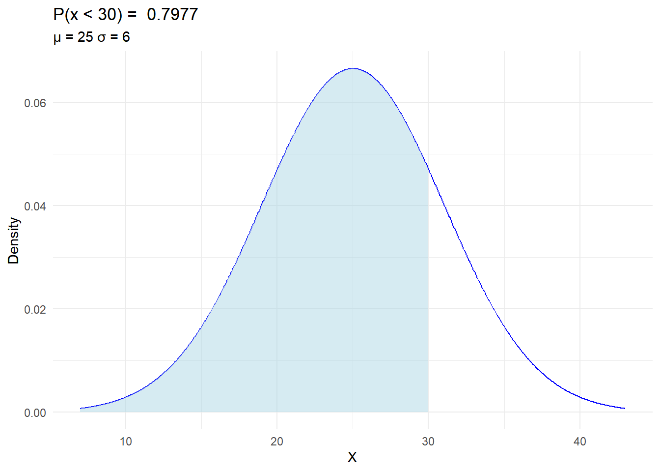
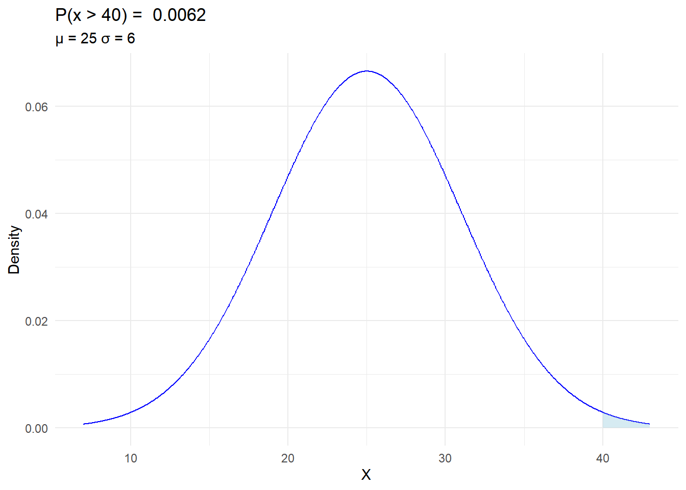
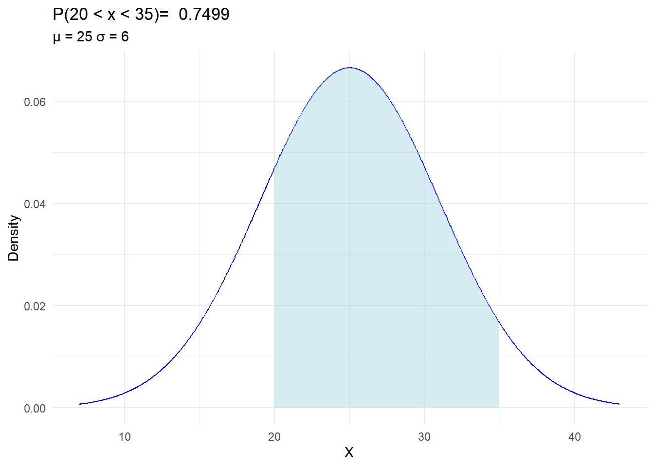
In Oklahoma, there is a research project focusing on the length of grass in centimeters in a particular region. The grass length follows a normal distribution with a mean (\(\mu\)) of 25 cm and a standard deviation (\(\mu\)) of 6 cm.
Calculate the probability that the grass in this region is shorter than 30 cm, i.e. \(P(x < 30)\).
Determine the probability that the grass exceeds 40 cm, i.e. \(P(x > 40)\).
What is the probability that the grass length falls between 20 cm and 35 cm, i.e. \(P(20 < x < 35)\)?
Visualize the probability distributions for each of these scenarios to help illustrate the concept.
This problem relates to understanding the distribution of grass lengths in Oklahoma and utilizing the properties of the normal distribution to answer questions about the probabilities associated with different grass lengths.
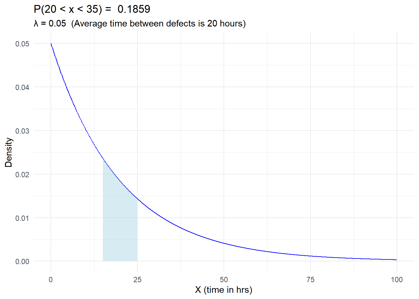
In a manufacturing process, the time between the occurrence of defects follows an exponential distribution. The average time between defects is 20 hours.
Calculate and Illustrate the probability that it will take between 15 and 25 hours before the next defect, i.e. \(P(15 < X < 25)\).
library(ggplot2)# Parameters for the exponential distribution:# Average time between defects is 20 hourslambda <-1/20xl <-15xr <-25x <-seq(0, 100, length =1000)y <-dexp(x, rate = lambda)ggplot(data.frame(x, y), aes(x)) +geom_line(aes(y = y), color ="blue") +geom_ribbon(data =data.frame(x = x[x > xl & x < xr], y = y[x > xl & x < xr]),aes(ymin =0, ymax = y),fill ="lightblue", alpha =0.5) +labs(title =paste("P(20 < x < 35) = " ,round(pexp(xr,lambda)-pexp(xl,lambda), 4) ),subtitle =paste("λ =", lambda, " (Average time between defects is 20 hours)"),x ="X (time in hrs)", y ="Density") +theme_minimal()
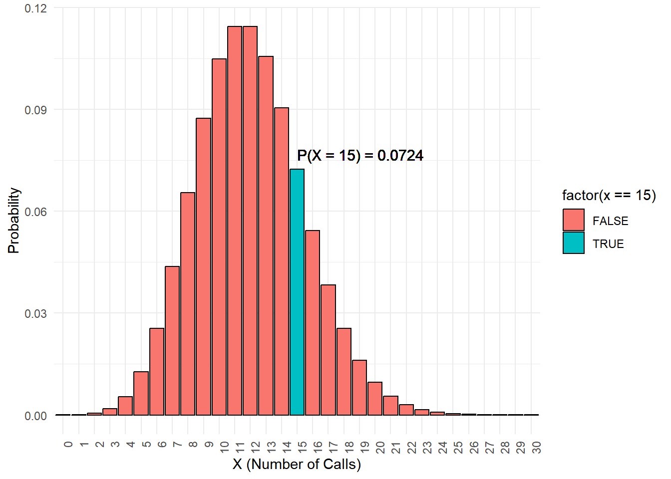
In a call center, calls are received at an average rate of 12 calls per hour, following a Poisson distribution.
Calculate and Illustrate the probability that exactly 15 calls will be received in the next hour, i.e. \(P(X = 15)\).
library(ggplot2)# Parameters for the Poisson distributionlambda <-12# Average rate of 12 calls per hour# Calculate probabilityp_X_equals_15 <-dpois(15, lambda)x <-0:30y <-dpois(x, lambda)# Create the bar plot for Poisson distributionggplot(data.frame(x, y), aes(x =as.factor(x), y = y)) +geom_bar(stat ="identity", aes(fill =factor(x ==15)), color ="black") +labs(x ="X (Number of Calls)", y ="Probability") +scale_x_discrete(labels =as.character(x)) +theme_minimal() +theme(axis.text.x =element_text(angle =90, hjust =1)) +geom_text(x =16, y =0.075, label =paste("P(X = 15) =", round(p_X_equals_15, 4)),hjust =0, vjust =0, color ="black", size =4)
Note: For Poisson-distributed data, a bar plot is more accurate as it shows the probability mass function for each integer value of the variable (i.e., the probability of observing exactly ‘k’ calls). A density plot would not be as suitable since it is better suited for continuous data.
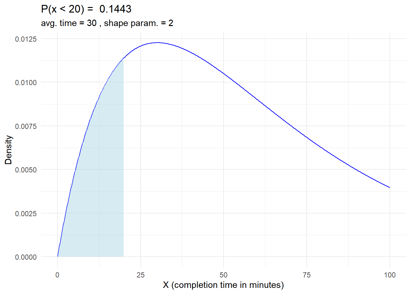
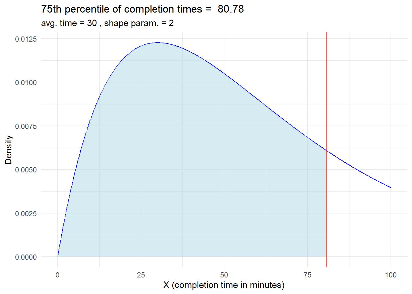
6.3.0.5 Time in a service center (Gamma distribution)
In a study of the time it takes for customers to complete a specific task at a service center, the completion times follow a gamma distribution. The average time for completion is 30 minutes, and the shape parameter is 2.
Determine the probability that a customer will take less than 20 minutes to complete the task, i.e. \(P(X < 20)\).
Calculate the 75th percentile of completion times, which indicates the time by which 75% of customers have completed the task.
# Load the required librarylibrary(ggplot2)# Parameters for the gamma distributionaverage_time <-30# Average time for completion is 30 minutesshape_parameter <-2# Calculate probabilitiesp_X_less_than_20 <-pgamma(20, shape = shape_parameter, rate =1/average_time)# Visualizationx <-seq(0, 100, length =1000)y <-dgamma(x, shape = shape_parameter, rate =1/average_time)# Create the density plot for gamma distributionggplot(data.frame(x, y), aes(x)) +geom_line(aes(y = y), color ="blue") +geom_ribbon(data =data.frame(x = x[x <20], y = y[x <20]),aes(ymin =0, ymax = y),fill ="lightblue", alpha =0.5) +labs(title =paste("P(x < 20) = " ,round(p_X_less_than_20, 4) ),subtitle =paste("avg. time =", average_time,", shape param. =", shape_parameter),x ="X (completion time in minutes)", y ="Density") +theme_minimal()
# Load the required librarylibrary(ggplot2)# Parameters for the gamma distributionaverage_time <-30# Average time for completion is 30 minutesshape_parameter <-2# Calculate percentilepercentile_75 <-qgamma(0.75, shape = shape_parameter, rate =1/average_time)percentile_75
[1] 80.77904
# Visualizationx <-seq(0, 100, length =1000)y <-dgamma(x, shape = shape_parameter, rate =1/average_time)# Create the density plot for gamma distributionggplot(data.frame(x, y), aes(x)) +geom_line(aes(y = y), color ="blue") +geom_ribbon(data =data.frame(x = x[x < percentile_75], y = y[x < percentile_75]),aes(ymin =0, ymax = y),fill ="lightblue", alpha =0.5) +labs(title =paste("75th percentile of completion times = " ,round(percentile_75, 2) ),subtitle =paste("avg. time =", average_time,", shape param. =", shape_parameter),x ="X (completion time in minutes)", y ="Density") +geom_vline(xintercept = percentile_75, color ="red") +theme_minimal()