a <- 3
b <- c(1,3,7)
d <- c("red","green","blue")1 Minimalistic Intro to R
In this section, I will equip you with the essential tools for using R to perform basic operations involving variables, lists, and dataframes. Additionally, I will provide a convenient quick-reference section showcasing typical visualizations that can effectively represent the distribution, correlations, and dependencies among your variables.
Note
If you possess prior experience in R programming, you may choose to skip the subsequent sections of this chapter.
1.1 R.
R is a programming language for statistical computing and graphics supported by the R Core Team and the R Foundation for Statistical Computing. Created by statisticians Ross Ihaka and Robert Gentleman, R is used among data miners, bioinformaticians and statisticians for data analysis and developing statistical software1. The core R language is augmented by a large number of extension packages containing reusable code and documentation.
1.2 Interactive scripts on this book (no need to install)
Using webr, I integrate interactive, inline fields directly into this document, allowing you to experiment with and execute simple code snippets as you progress through this book.
1.3 Using R on your browser (no need to install, no cloud)
Webr allows you to access R directly within your browser, offering a more secure environment as no files are uploaded to the cloud. This setup provides four distinct areas for an efficient workflow:
- A script field for writing and editing code
- A console for executing commands and viewing outputs
- A file manager to organize and access your files
- A plot window for visualizing data
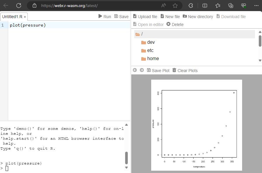
This browser-based solution is more advanced than typical inline interactive fields. With Webr, you can load your own datasets, get help documentation and enjoy features such as the syntax-highlighting editor found typically only in RStudio.
1.4 RStudio IDE.
Used by millions of people weekly, the RStudio integrated development environment (IDE) is a set of tools built to help you be more productive with R and Python. It includes a console, syntax-highlighting editor that supports direct code execution. It also features tools for plotting, viewing history, debugging and managing your workspace.
To install RStudio Desktop follow the two-steps instructions in the following link:
https://posit.co/download/rstudio-desktop/ 2
Throughout this book, you’ll find that much of the code can be executed either directly in the RStudio Console or by organizing it into small scripts. To assist in understanding functions and their usage, RStudio offers a helpful pane dedicated to providing descriptions, syntax explanations, and examples for functions.
Let’s briefly explore the main panes within RStudio:
1.4.1 Testing Code in the Console:
- Console Testing:
- Open RStudio and locate the Console pane at the bottom left.
- Type or paste your R code directly into the Console.
- Press Enter to execute a single line or a selection of code.
- Results or output will be displayed immediately below the executed code in the Console.
1.4.2 Writing and Testing Scripts:
- Script Creation:
- Go to
File>New File>R Scriptor use the shortcutCtrl + Shift + N(Cmd + Shift + N on Mac) to create a new script. - Write or copy your R code in the script editor pane.
- Go to
- Executing Code from Scripts:
- Highlight the code you want to execute.
- Click on the
Runbutton in the script editor toolbar or use the shortcutCtrl + Enter(Cmd + Enter on Mac). - The code will be sent to the Console for execution, and the output will be displayed there.
- Saving and Running Scripts:
- Save your script using
File>SaveorCtrl + S(Cmd + S on Mac). - To execute the entire script, use
Sourcebutton in the script editor toolbar, or pressCtrl + Shift + S(Cmd + Shift + S on Mac). - This will run the entire script in the Console.
- Save your script using
1.4.3 Inspecting Variables in the Environment Pane:
- Environment Pane:
- Locate the Environment pane in the top right (by default).
- All currently defined variables, data frames, functions, and other objects will be displayed here.
- Viewing Variable Contents:
- Click on any variable to view its contents. For data frames, you can see the data in a spreadsheet-like format.
- Use the search bar within the Environment pane to find specific variables.
- Modifying Variables:
- You can modify variables directly in the Environment pane by double-clicking on their values and entering new data.
1.4.4 Using the Help Pane:
- Accessing Help:
- Locate the Help pane in the bottom right by default.
- Use the
?function_nameorhelp(function_name)in the Console to bring up the help page for a specific function.
- Navigating Help Pages:
- Search for a function, package, or topic in the search bar within the Help pane.
- Click on a function name or topic in the help page to get detailed information, usage, and examples.
- Package Help:
- To access help for a specific package, use
library(package_name)orrequire(package_name)to load the package and then use?package_nameorhelp(package = "package_name")to access the package documentation.
- To access help for a specific package, use
1.5 Data Frames
One of the most commonly used data structures for data manipulation and analysis in R is called data.frame. It is similar to a spreadsheet or a SQL table, where data is organized in rows and columns.
But before we create a dataframe in R, let’s start with easier data structures.
If you know to answer the following questions, you can skip this section.
- How we store single number into a variable?
- How we store a list of numbers?
- How we store a list of words?
- How we store a list of lists?
easy peasy! 3
What we did?
- store the number
3into the variablea. - store the list of numbers
1,3,7into the variableb. This is also called avector. - store the list of
RGBcolors into the variabled. - we use the function
c()to “concatenate” elements into a list.
That was easy!, but how can I store several lists into one object4 ?
data.frame()
This function in R will return a data structure which place each list as a column. Similar to a spreadsheet.
For example if I want to put together the lists b and c (already in memory) the code should be:
data.frame(b,d) b d
1 1 red
2 3 green
3 7 blueFrom the output of your last code, you can observe that the column names correspond to the names of your lists. Each row is assigned a unique number, similar to a spreadsheet.
Now, let’s perform a multiplication operation on every element of list b using the value stored in variable a. We will create a new column called ab to store the results. Additionally, for the second column, we will insert the list of colors (d) and rename it as colores. The code for this operation would be:
df <- data.frame(ab = a*b, colores = d)
df # calling the variable will print the dataframe
ab colores
1 3 red
2 9 green
3 21 blueAs demonstrated, it is possible to easily rename, modify, and perform operations between variables (columns) using a single line of code. This flexibility allows for efficient data manipulation and transformation5.
1.5.1 How we access the elements of a list?
easy peasy!
Accessing elements of a list is a straightforward process. It is done by referencing the index position of the desired element. For instance, if you wish to retrieve the second element of list d, you can use the code d[2].
d[2][1] "green"1.5.2 How we access all the elements of a column from a dataframe?
Accessing all the elements of a column from a dataframe is simple. We can achieve this by using the name of the dataframe, followed by a dollar sign, and then the column name. e.g.
df$colores[1] "red" "green" "blue" 1.5.3 How we access the third element of the second column of a dataframe?
To access the third element of the second column of a dataframe, you have several options:
- Square bracket notation.
- Start with the dataframe’s name, followed by an open square bracket.
- Inside the bracket, specify the row number, followed by a comma, and then the column number:
df[3,2][1] "blue"- Exploring: Column Name and Row Position:.
- Alternatively, you can use the column name followed by the row position to access the value::
df$colores[3][1] "blue"Both methods will yield the same result, allowing you to access the desired element in the dataframe.
Note: I recommend using the exploration method, especially in RStudio, due to its helpful autocomplete functionality. After you input the name of the object followed by a dollar sign $, RStudio will present you with a dropdown menu containing all the elements within that structure. In this case, typing df$ will display a list of all the column names inside the dataframe df, allowing you to select the one you want. This feature significantly reduces the likelihood of typographical errors in your code.
1.6 Context, Structure and Summary of Statistics for Datasets.
R, have incorporated a vast of preload datasets, typically in the form of a dataframe.
1.6.1 Context.
One frequently encountered dataset in data science examples and tutorials is the ‘iris’ dataset, originally collected and analyzed by ‘Fisher & Anderson’ in the 1930s. This dataset focuses on measuring and examining the correlations among physical characteristics of various flower species from the Gaspe Peninsula. The ‘iris’ dataset is structured as a dataframe comprising 150 observations (rows) and 5 variables (columns). To obtain additional information about the background and context of this dataset, you can utilize the following command:
?iris
1.6.2 Structure.
To know more about the structure of a dataframe we can use the function str():
str(iris)'data.frame': 150 obs. of 5 variables:
$ Sepal.Length: num 5.1 4.9 4.7 4.6 5 5.4 4.6 5 4.4 4.9 ...
$ Sepal.Width : num 3.5 3 3.2 3.1 3.6 3.9 3.4 3.4 2.9 3.1 ...
$ Petal.Length: num 1.4 1.4 1.3 1.5 1.4 1.7 1.4 1.5 1.4 1.5 ...
$ Petal.Width : num 0.2 0.2 0.2 0.2 0.2 0.4 0.3 0.2 0.2 0.1 ...
$ Species : Factor w/ 3 levels "setosa","versicolor",..: 1 1 1 1 1 1 1 1 1 1 ...As you can see in the output we obtain the following:
- Number of observations.
- Number of variables.
- Names of the variables.
- Type of the variables. In this case 4 numerical, and one
type Factorwhich have the classification of what specie of flower the observation corresponds. - A preview of the first 10 rows.
1.6.3 Summary of statistics
To gain deeper insights into the numerical distribution of our variables, we can make use of the summary() function in R:
summary(iris) Sepal.Length Sepal.Width Petal.Length Petal.Width
Min. :4.300 Min. :2.000 Min. :1.000 Min. :0.100
1st Qu.:5.100 1st Qu.:2.800 1st Qu.:1.600 1st Qu.:0.300
Median :5.800 Median :3.000 Median :4.350 Median :1.300
Mean :5.843 Mean :3.057 Mean :3.758 Mean :1.199
3rd Qu.:6.400 3rd Qu.:3.300 3rd Qu.:5.100 3rd Qu.:1.800
Max. :7.900 Max. :4.400 Max. :6.900 Max. :2.500
Species
setosa :50
versicolor:50
virginica :50
As you can observe, with a single line of code, we’re able to calculate various statistical parameters for each of the variables:
- Minimum Value.
- First Quartile (25th percentile): The data point below which 25% of the data falls when sorted.
- Second Quartile or Median: The data point that divides the dataset in half when sorted.
- Third Quartile (75th percentile): The data point below which 75% of the data lies when sorted.
- Maximum Value.
To obtain more advanced statistics about data distribution, in the following sections, we will employ functions from the psych library. However, before delving into more advanced statistics, let’s explore some typical ways to visualize our data.
1.7 Visualizations
Although mathematicians often resort to statistical parameters for data analysis, an initial and more powerful approach is to create visual plots. These visuals effectively depict variable distributions and relationships, offering valuable insights and a clearer understanding of the data’s characteristics.
1.7.1 bar plot
Let’s start by creating a simple data.frame() that represents the heights of my family members:
my_family <- data.frame(
  names= c('Alexandra', 'Lucia', 'Henry', 'Enrique'),
  height = c(180, 166, 188, 169))
To generate a basic bar plot, we can employ the barplot() function. We’ll set up a formula to visualize the relationship we’re interested in. In this particular case, we aim to explore the variations in the heights of my family members, specifically depicting the connection between the height variable (mapped to the y-axis) and the names variable (mapped to the x-axis) from my dataframe.
barplot(height ~ names, data = my_family)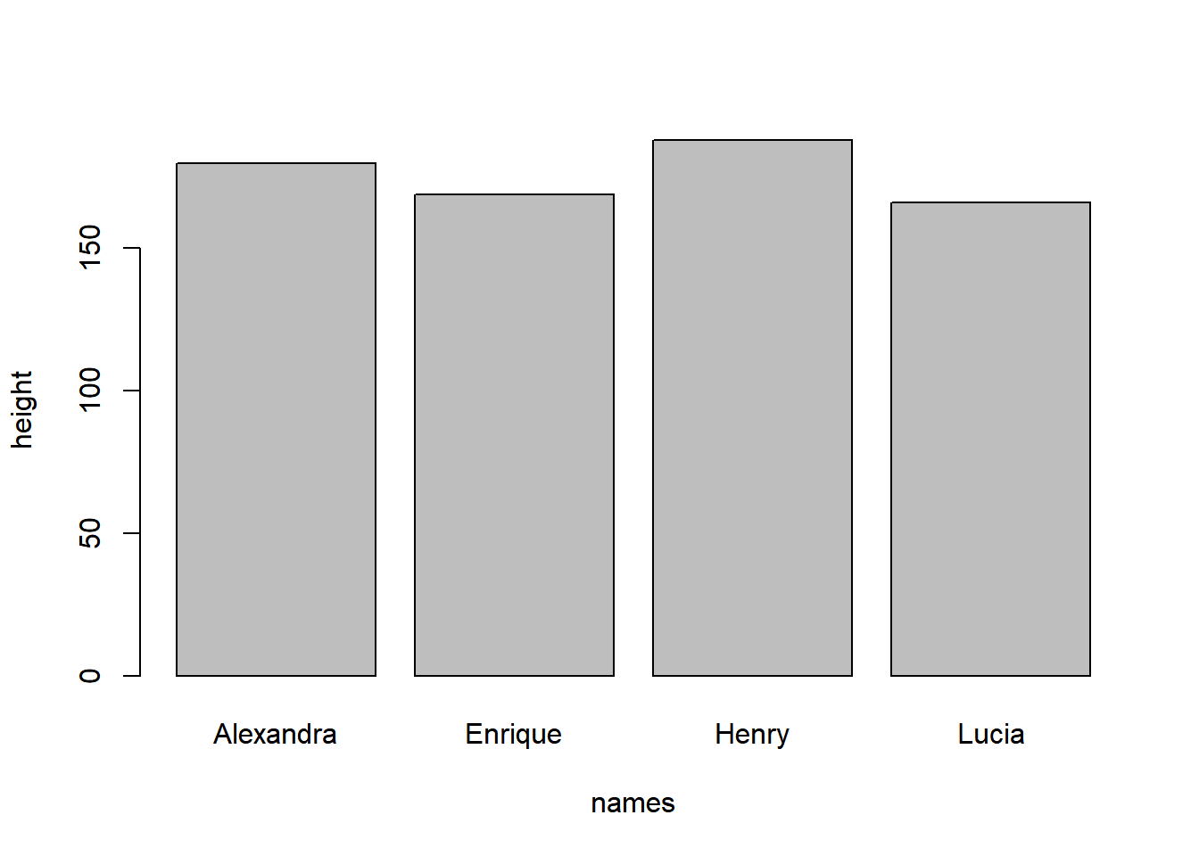
barplot() illustrating the variation in heights among Valderrama family members.
Please note that we use the ~ symbol to denote the relationship between variables in the equation definition.
For a more refined and visually appealing plot, we can utilize the ggplot2 library.
ggplot follow the grammar of graphics, ensuring that complex graphics can be built up from simpler parts using a consistent structure.
The essential functions include:
ggplot(): Create a ggplot figure.aes(): Define the aesthetic mappings (e.g., x, y, color, fill) for the figure.geom_functions (e.g.,geom_points(),geom_bar(),geom_line(),geom_density(), etc): Add layers to the figure.labs(): Add labels to the figure.theme_functions (e.g.thema_bw(),theme_classic()): Apply pre-defined themes to the figure.
For example for our simple bar_plot from base-R, a simple the code in ggplot2 is:
library(ggplot2)
ggplot(data=my_family, aes(x=names, y=height))+
  geom_bar(stat="identity")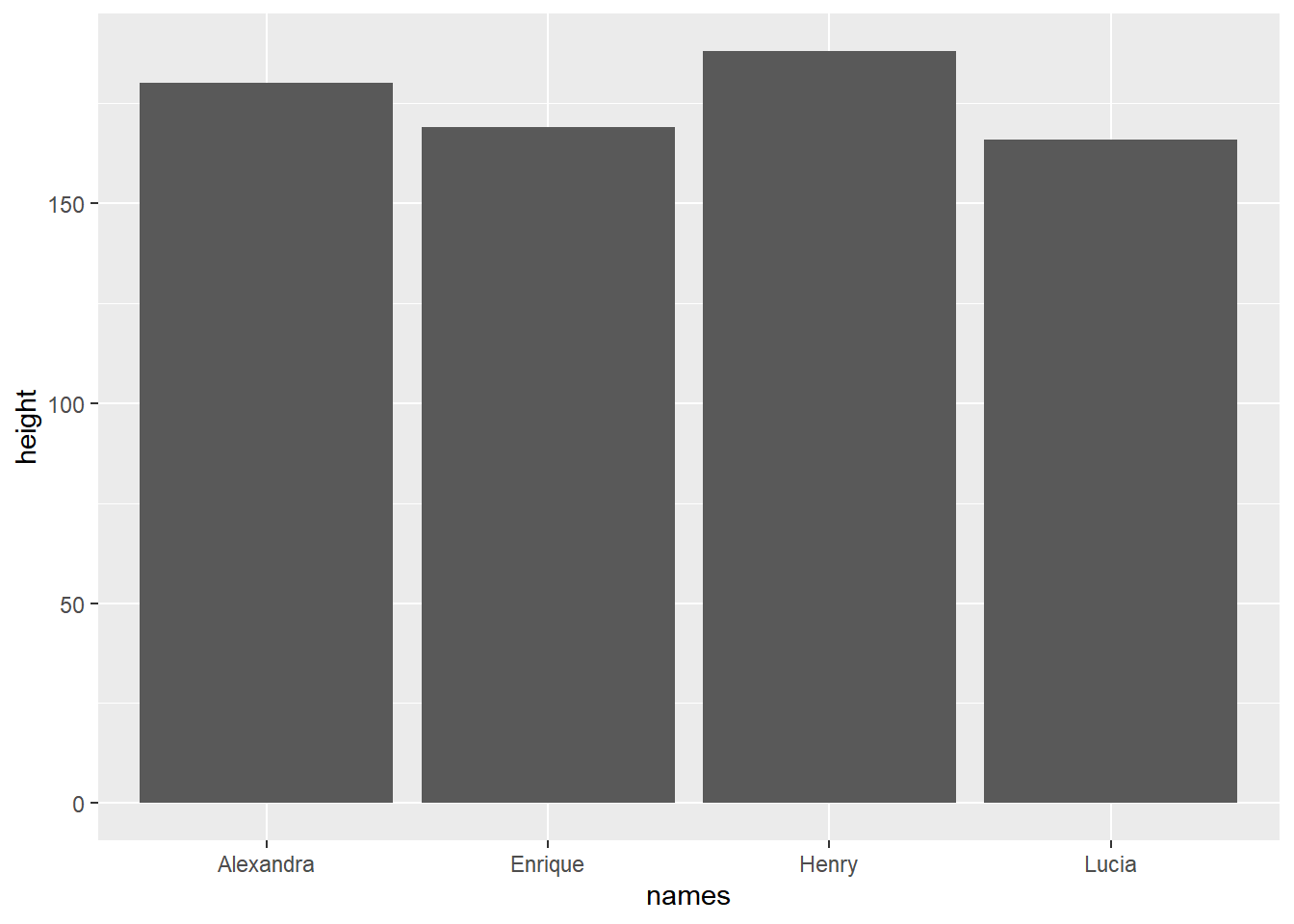
ggplot() + geom_bar(). An enhanced bar plot illustrating the variation in heights among the Valderrama family members.
When creating a plot with ggplot, we begin by providing the data in the form of a dataframe. We then define the aesthetics using the aes() function, specifying which variables should be mapped to the x-axis and y-axis. Additionally, we specify the type of plot we desire. In this instance, we use + geom_bar(stat = "identity") to create a bar plot.
To add a touch of visual distinction, we can assign different colors to each family member’s name by including the fill = names parameter within the aes() function:
ggplot(data=my_family, aes(x=names, y=height, fill = names))+
  geom_bar(stat="identity")+
  ylab("height (cm)")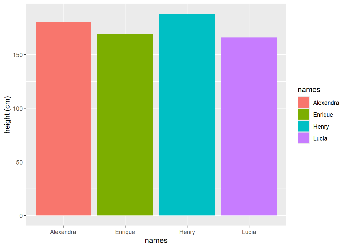
ggplot() + geom_bar(). A more refined bar plot illustrating the variation in heights among Valderrama family members. Different colors are assigned to each member using the fill = names parameter. Additionally, the y-axis label is customized with ylab() to indicate the corresponding unit of measurement.
Note: We use stat = “identity” because there is no need to aggregate the observations.
For instance, if you wish to count and visualize the number of observations for each species in the iris dataset, setting stat = "count" will produce the desired result:
ggplot(iris,aes(x=Species, fill=Species))+
  geom_bar(stat = "count")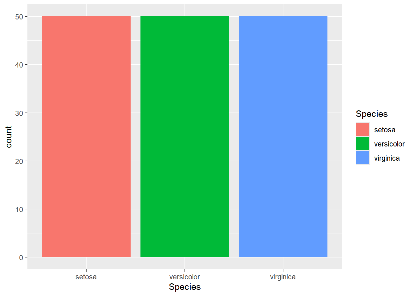
ggplot() + geom_bar(). By specifying the count parameter instead of identity for the stat function, the observations for each species are aggregated.
1.7.2 stem and leaf plot
Lets store the first 50 primes into a variable with name myvector:
myvector <- c(2, 3, 5, 7, 11, 13, 17, 19, 23, 29, 31, 37,
              41, 43, 47, 53, 59, 61, 67, 71, 73, 79,
              83, 89, 97, 101, 103, 107, 109, 113, 127,
              131, 137, 139, 149, 151, 157, 163, 167, 173,
              179, 181, 191, 193, 197, 199, 211, 223, 227, 229)
length(myvector)
[1] 50Code6 to plot:
stem(myvector, scale = 2)
  The decimal point is 1 digit(s) to the right of the |

   0 | 23571379
   2 | 3917
   4 | 13739
   6 | 17139
   8 | 397
  10 | 13793
  12 | 7179
  14 | 917
  16 | 3739
  18 | 11379
  20 | 1
  22 | 379
The plot displays a list of prime numbers over 2-decade intervals, and we can readily observe that the distribution is not uniform.
- In the range of 80 to 99, there are only 3 prime numbers:
83, 89, 97 - In the range of 0 to 19, there are 8 prime numbers:
2, 3, 5, 7, 11, 13, 17, 19
This prompts a question: Is there a point beyond which we can’t find more prime numbers, or what is the underlying shape of the prime number distribution?
1.7.3 histogram plot example
hist(myvector,nclass=10)
Using the library RcppAlgos I can get a list of any amount of primes numbers, e.g.:
library(RcppAlgos)
primes_1e2 <- primeSieve(100) # the first 100 primes
primes_1e4 <- primeSieve(1e4) # the first 10 thousands primes
primes_1e6 <- primeSieve(1e6) # the first million primes
hist(primes_1e2)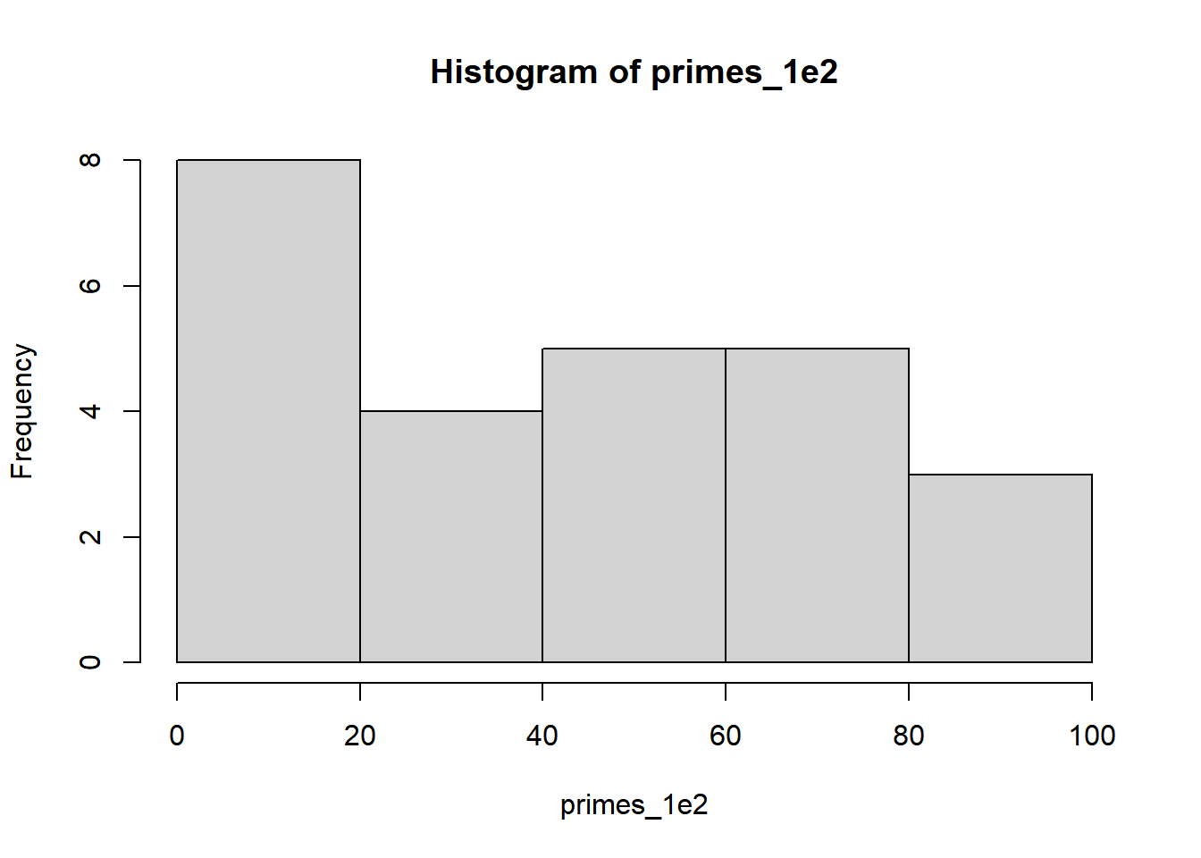
To compare how the distribution of primes changes with the number of primes, I can place side by side plots by using the par() function:
#First we create the window: 1 row 3 columns
par(mfrow = c(1, 3))
# now we create the plots:
hist(primes_1e2)
hist(primes_1e4)
hist(primes_1e6)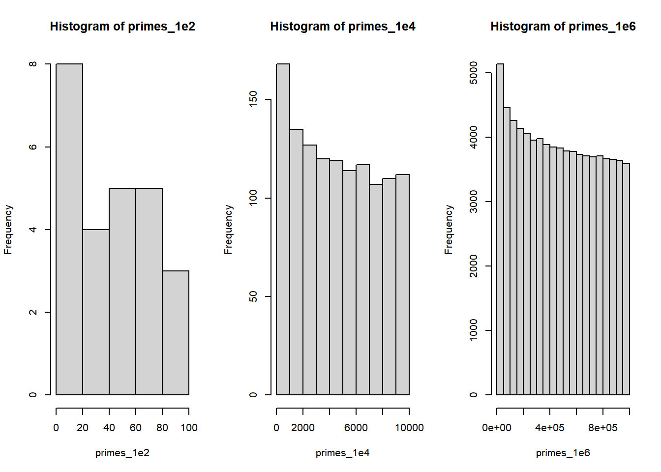
Enough about prime numbers; I’ll leave further exploration up to you.
Now, let’s shift our focus and create a histogram to gain a better understanding of the distribution of petal widths from the iris dataset and uncover any potential dependencies.
hist(iris$Petal.Width)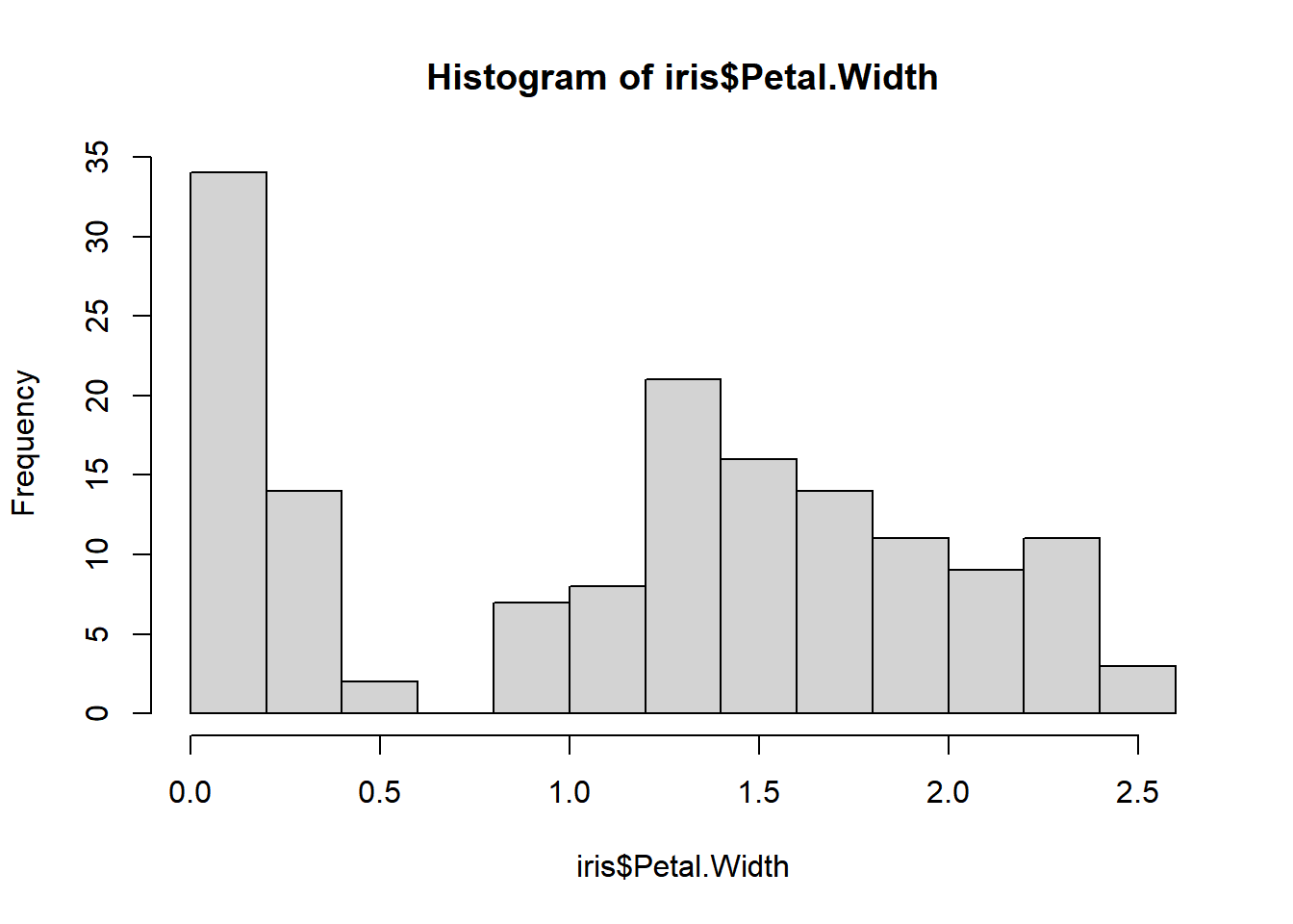
Observing the histogram, it appears that there might be two distinct clusters in the data.
For a more visually informative representation, let’s use ggplot2:
ggplot(iris,aes(x=Petal.Width,fill=Species))+
  geom_histogram()
`stat_bin()` using `bins = 30`. Pick better value with `binwidth`.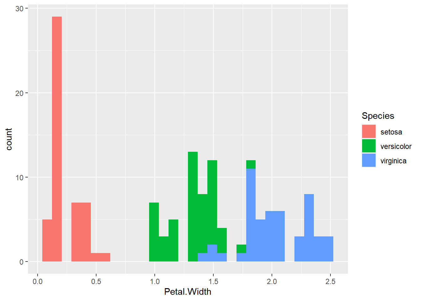
Which flower specie have the wider petal in average?
1.7.4 Density Plot
Since the width of a flower is a continuous variable, it may be more suitable to visualize it using a density plot:
ggplot(iris,aes(x=Petal.Length, fill=Species))+
  geom_density(color="darkblue")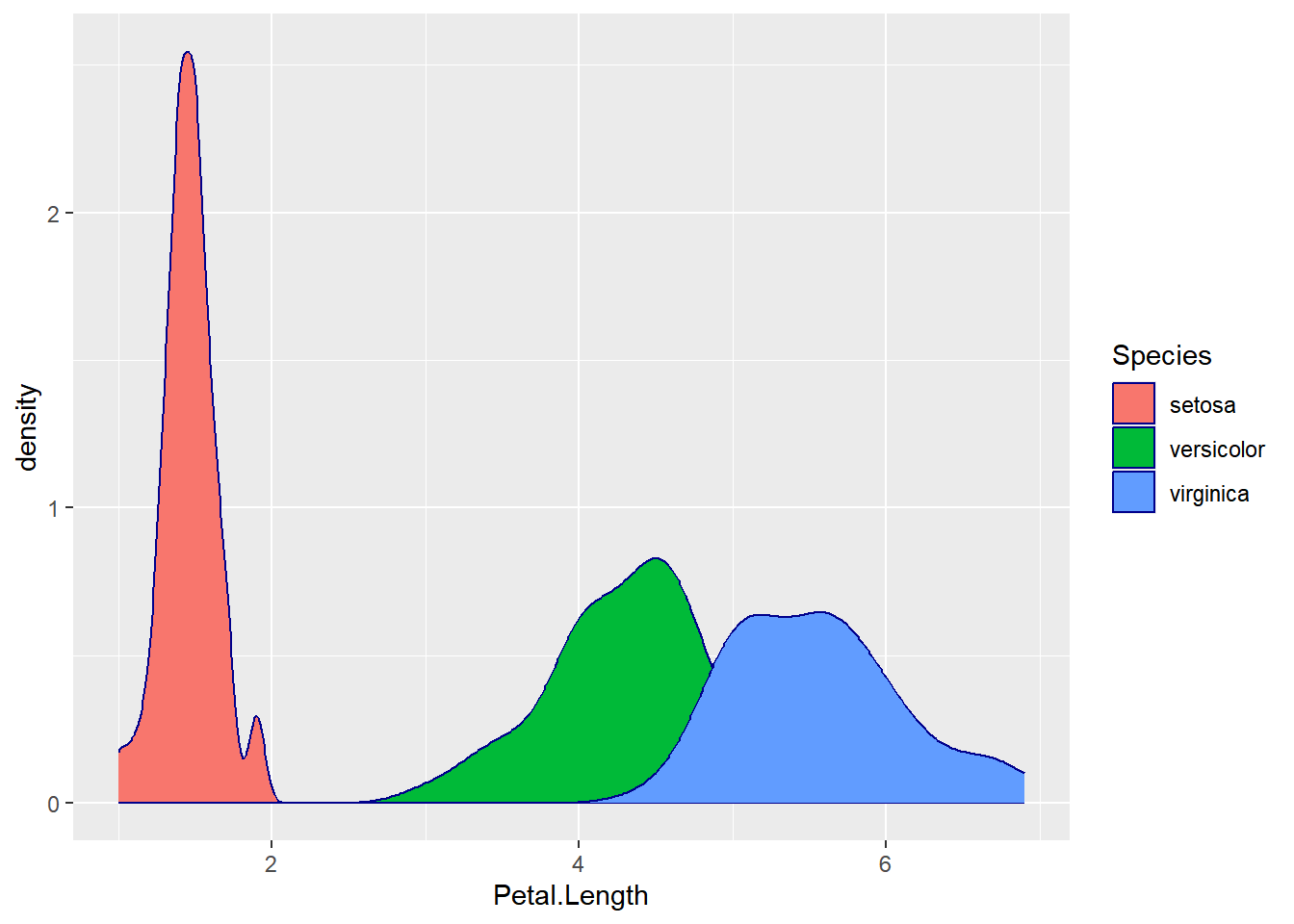
A density plot offers a smooth representation of the data distribution and can be especially useful for continuous variables like petal length.
1.7.5 Dot Plots
For discrete variables, especially when examining the distribution of individual data points or groups, dot plots can be a valuable tool:
ggplot(as.data.frame(primes_1e4), aes(x = primes_1e4)) +
  geom_dotplot(method = "histodot",binwidth = 200,
               stackdir = "center",fill = "blue") +
  scale_y_continuous(NULL, breaks = NULL)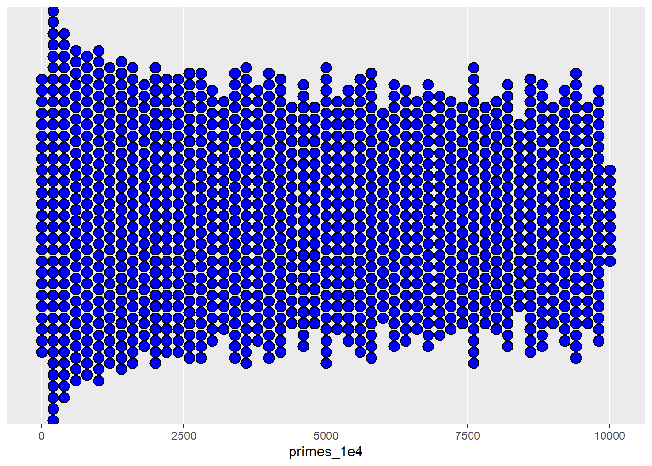
A dot plot provides a clear and concise way to visualize the distribution of discrete data points, making it easier to discern patterns and outliers.
1.7.6 Boxplots
Boxplots are excellent visualizations that provide insights into data distribution by displaying quartiles, maximum and minimum values, outliers, and skewness.
Here’s a simple boxplot of the petal width for the iris dataset:
boxplot(iris$Petal.Width)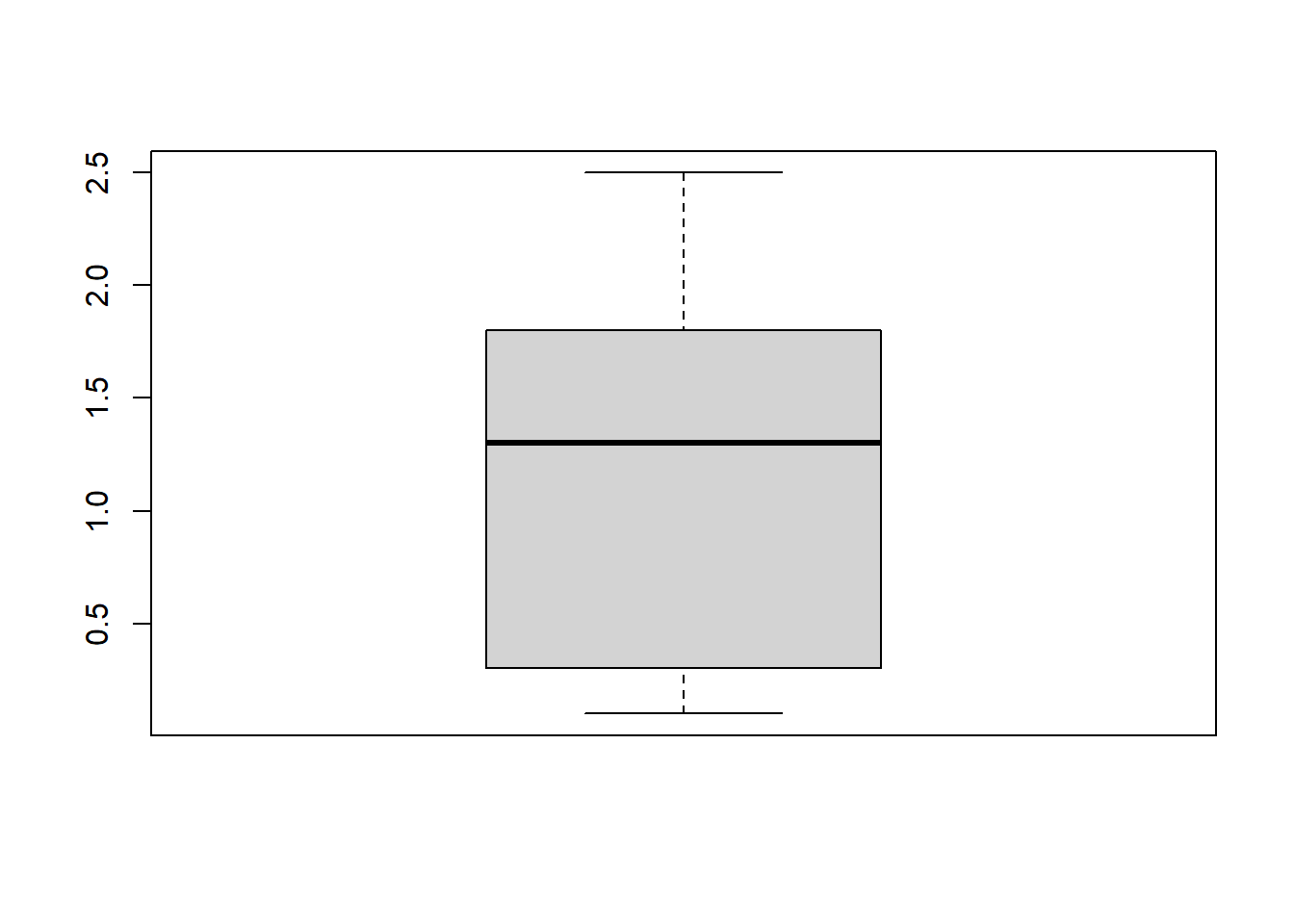
boxplot() displaying the range of petal width values in the iris dataset. The plot illustrates the distribution based on a five-number summary, including the ‘minimum,’ first quartile (Q1), median, third quartile (Q3), and ‘maximum.’
ggplot2 offers a convenient way to visualize the distribution differences between species with just one line of code:
ggplot(iris, aes(x=Species, y=Petal.Width, fill=Species)) +
  geom_boxplot()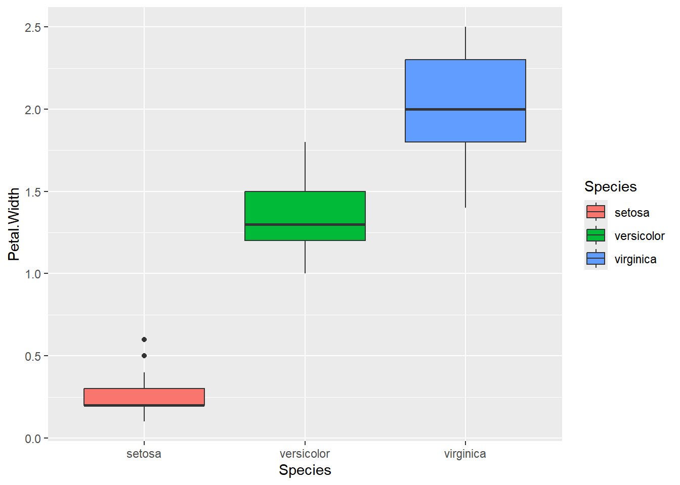
ggplot and geom_boxplot(), you can easily understand how each petal width is distributed for each species and compare their distributions.
These boxplots enable you to compare the distribution of petal widths across different species and identify any variations or outliers.
1.7.7 Scatter plot
Scatter plots are excellent for visualizing the relationship between two variables. Let’s start with a simple example:
# Lets create a subset dataframe which contain only versicolor data
versicolor <- iris[iris$Species=="versicolor", ]
# Let's plot the subset:
plot(versicolor$Petal.Width,versicolor$Petal.Length)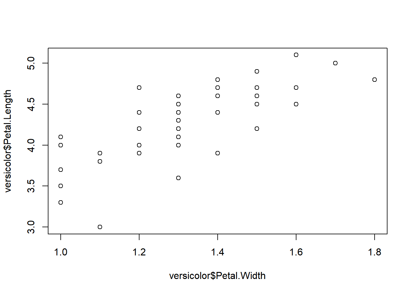
The plot suggests a positive linear correlation between petal width and petal length.
For a more sophisticated scatter plot, you can utilize ggplot2:
ggplot(iris, aes(x=Petal.Width,y=Petal.Length,
                 color=Species))+geom_point()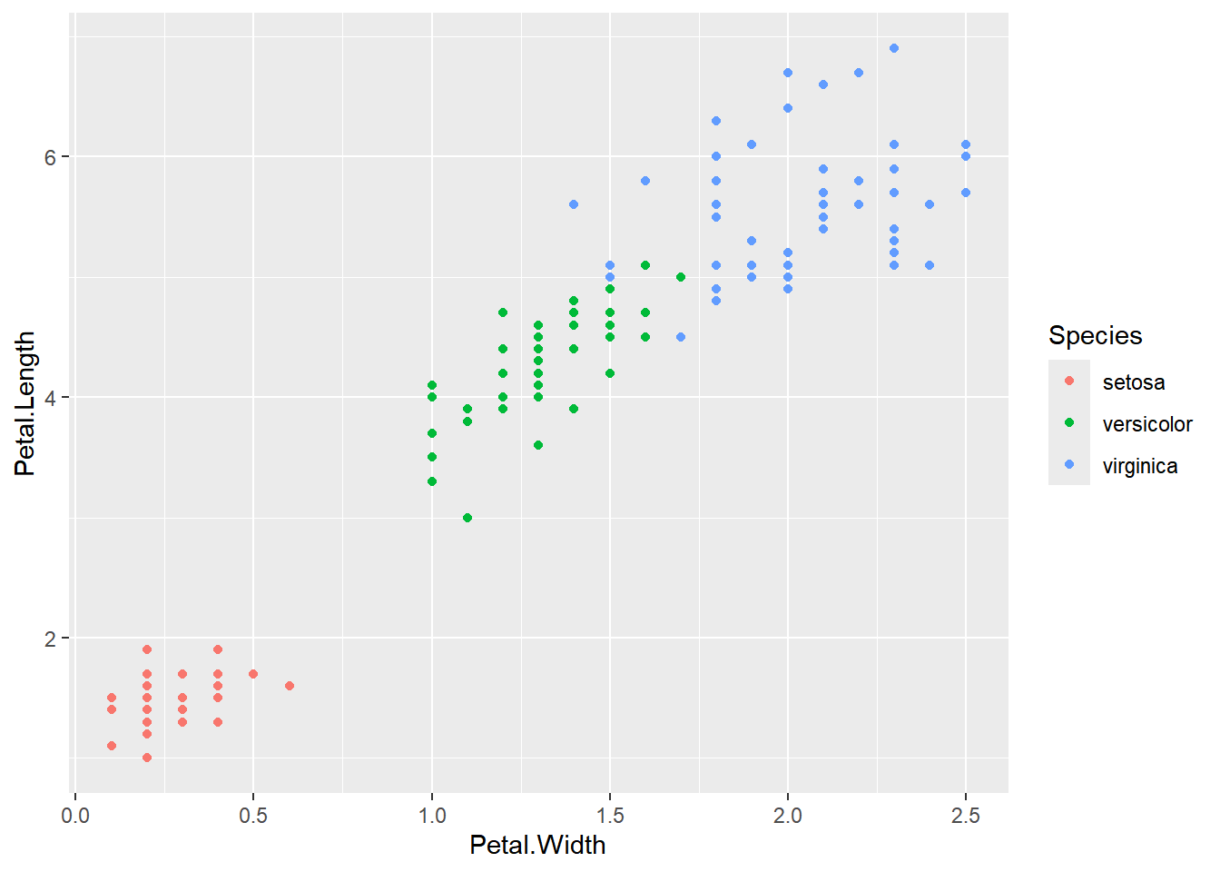
The ggplot2 scatter plot not only displays the relationship between variables but also distinguishes different species by color, providing a more informative visualization.
1.7.8 Plot all dataframe
To be able to obtain a quick general view of all the data we can use the function plot()
plot(iris)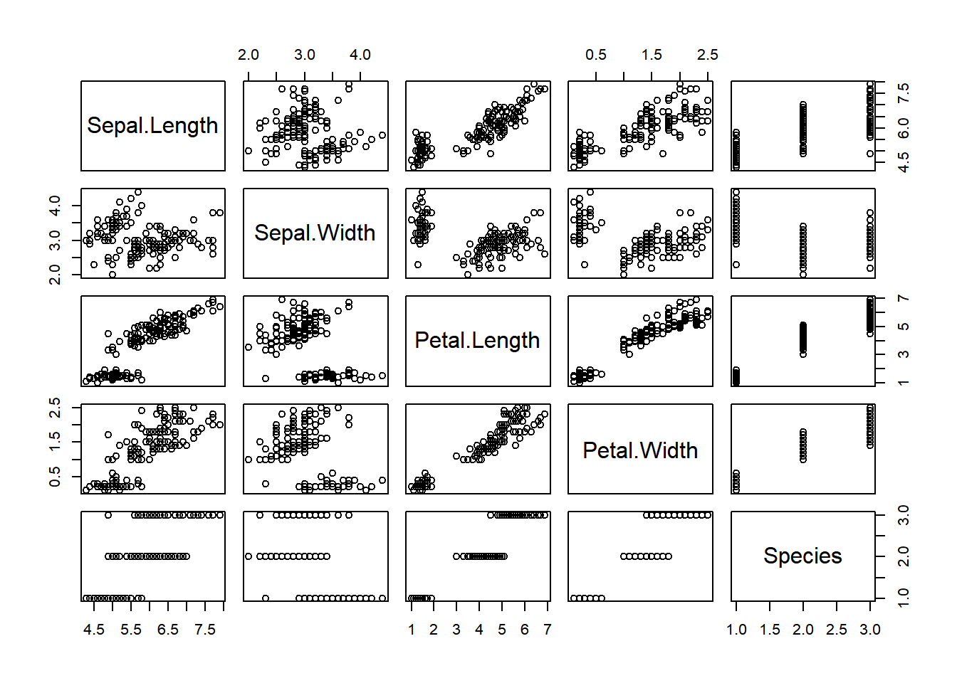
plot() function.
Upon initial observation, it becomes evident that the data exhibits clusters based on the Species category. Additionally, it is apparent that certain variables display linear dependencies.
1.7.9 Correlation Plot
To be able to measure the strength of the linear correlation we can use the function chart.Correlation() from the library PerformanceAnalytics
library(PerformanceAnalytics)
chart.Correlation(iris[,-5],
                  method="pearson", # also spearman or kendall
                  histogram=TRUE,
                  pch=7,
                  cex = 1.2)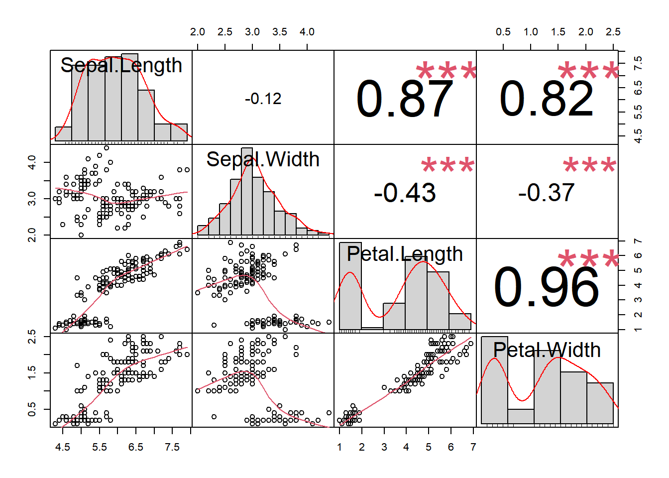
PerformanceAnalytics::chart.Correlation() function.
Also from the psych library we can obtain a similar plot using the function corPplot():
library(psych, warn.conflicts = FALSE)
corPlot(iris[,-5], cex = 1.2)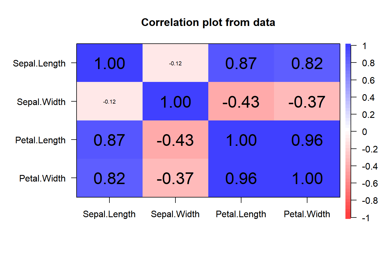
psych::corPlot() function.
Also from the ggcorrplot library the function ggcorrplot provide a similar plot:
library(ggcorrplot)
df <- iris[,-5] # removing non-numerical variable
corre.plot <- ggcorrplot(
  round(cor(df), 1), # correlations calculation
  p.mat = cor_pmat(df), # p-values calculation
  hc.order = TRUE, type = "lower", outline.col = "white"#aesthetics
  )
corre.plot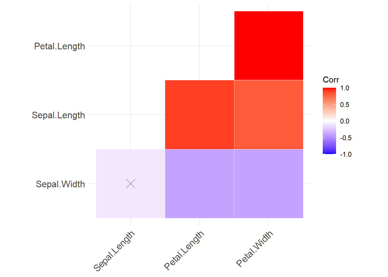
cor_mat() function.
Note: If one of the correlations was not statistically significant, a cross will appear inside of the corresponding box.
And adding interactivity7 is as simple as given one more instruction when using plotly library:
library(plotly)
ggplotly(corre.plot)# one line for interactive.ggcorrplot and ggplotly functions. Span the cursor over plot will display additional information.
1.7.10 Pie plot
Let’s create a new data.frame() which contain the amount of calories that a 2000 calorie target should have according to USDA’s Dietary Guidelines for Americans8:
US_2000 <- data.frame(
  macronutrients <- c('Carbs','Protein', 'Fat'),
  calories <- c(1020,360,660),
  grams <- c(255,90,73))
If instead of vertical bars I will like to display as pies of a circle, then I need to add coord_polar("y", start=0) + theme_void() to my code and change x to "":
ggplot(data=US_2000, aes(x="", y=calories, fill = macronutrients)) +
  geom_bar(stat = "identity") +
  coord_polar("y", start=0) +
  theme_void()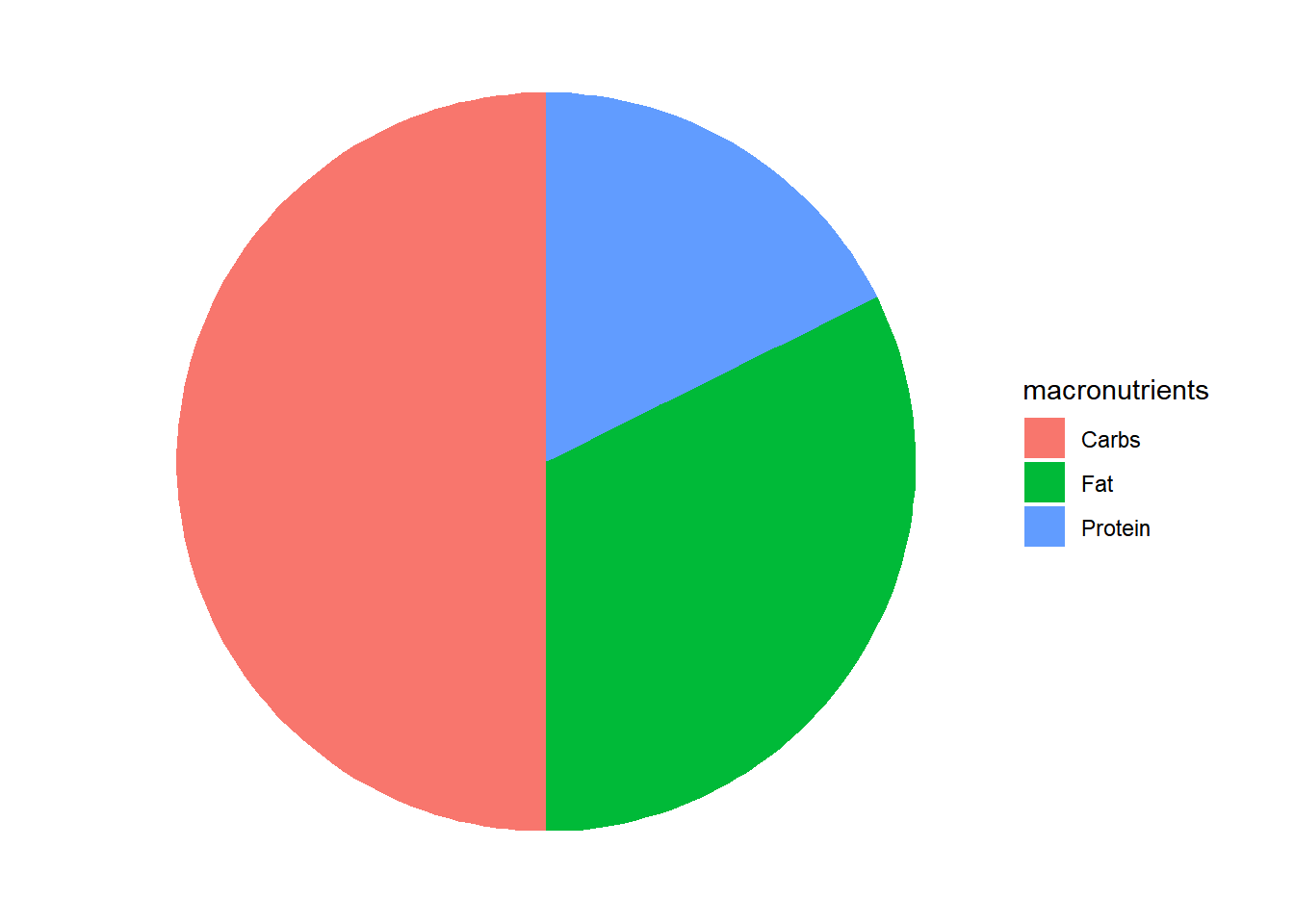
good will be to add the corresponding percentages to this plot. We do that by diving by the total of calories:
ggplot(data=US_2000, aes(x="", y=calories, fill = macronutrients)) +
  geom_bar(stat = "identity") +
  coord_polar("y", start=0) +
  theme_void() +
  geom_text(aes(label = paste0(round(calories/2000*100,0), "%")), position = position_stack(vjust=0.5))
also we can add a title by adding + ggtitle("Percentage of macronutrients \n in 2000 calories diet goal.")
ggplot(data=US_2000, aes(x="", y=calories, fill = macronutrients)) +
  geom_bar(stat = "identity") +
  coord_polar("y", start=0) +
  theme_void() +
  geom_text(aes(label = paste0(round(calories/2000*100,0), "%")),
            position = position_stack(vjust=0.5))+
  ggtitle("Calories of macronutrients in a 2000 calories US-diet plan.")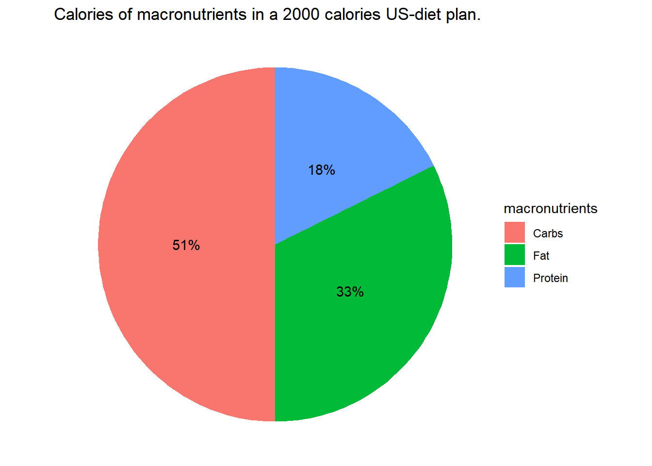
Now for example I can compare with a Mediterranean diet:
Med_2000 <- data.frame(
  macronutrients <- c('Carbs','Protein', 'Fat'),
  calories <- c(1100,280,680),
  grams <- c(275,70,76))
ggplot(data=Med_2000, aes(x="", y=calories, fill = macronutrients)) +
  geom_bar(stat = "identity") +
  coord_polar("y", start=0) +
  theme_void() +
  geom_text(aes(label = paste0(round(calories/2000*100,0), "%")),
            position = position_stack(vjust=0.5))+
  ggtitle("Calories of macronutrients in a 2000 calories mediterranean-diet plan.")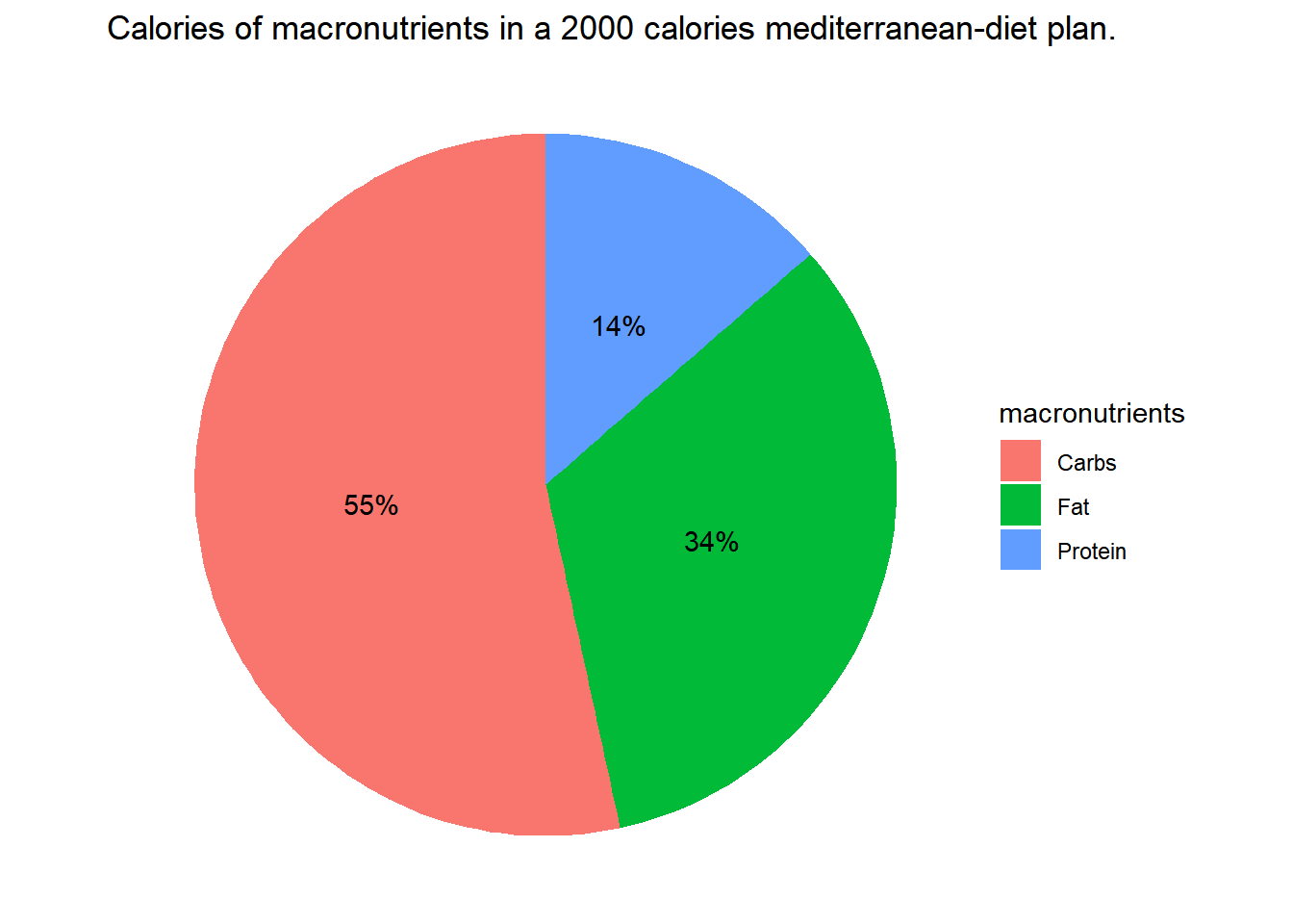
A more accurate dietary recommendation tailored to an individual’s needs depends on several factors, including:
- Age
- Sex
- Height
- Weight
- Physical activity level
In an upcoming section of this book, we will delve deeper into this topic, analyzing data sourced from: https://www.myplate.gov/myplate-plan. This comprehensive dataset encompasses all of these variables, allowing us to provide a more in-depth exploration.
1.7.11 Bubble plots + Interactivity
How a variable changes, typically depends in more than one variable. A correlation plot allows to display the strengthen between pairs of variables. What we can do when a variable depends on more than one?
To display the relationships between three variables we can constructive 3D plots, one variable for axis, however is difficult to visualize in 2D documents.
To display the relationships of 2, 3, 4 or more variables we can assign the attributes of each data point to a feature of each scatter plot:
- One variable in each axis, 2-axis -> 2 variables.
- One variable for the color of the scatter.
- One variable for the size of the scatter.
To illustrate, let’s consider the dataset from the library gapminder. This dataset is an excerpt of the Gapminder data on life expectancy, GDP per capita, and population by country.
library(ggplot2)
library(plotly)
library(gapminder)
library(dplyr)
p <- gapminder %>%
  filter(year==2007) %>%
  ggplot( aes(gdpPercap, lifeExp, size = pop, color=continent)) +
  geom_point() +
  theme_bw()
p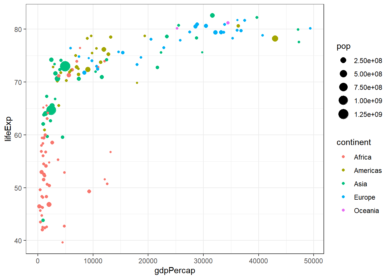
ggplotly(p) # one line for interactivity1.7.12 Plotting Function Curves
1.7.12.1 Custom Function Definition
When creating a custom function, it’s essential to adhere to the following syntax:
function_name <- function(variable1, variable2) {
  # Function definition here
}
For instance, if you wish to define a parabolic function named “parabola,” you can do so as follows:
parabola <- function(x) {
  x^2
}
To compute the value of the “parabola” function at a specific input, you can conveniently pass the parameter value to the function like this:
parabola(7)[1] 49# OR
parabola(x = 7)[1] 49Note: If your function involves more than one variable, it’s advisable to provide the value using the variable’s name.
1.7.12.2 Plotting a Function
To plot a function, you can use the curve() function:
curve(parabola, from = -7, to = 7)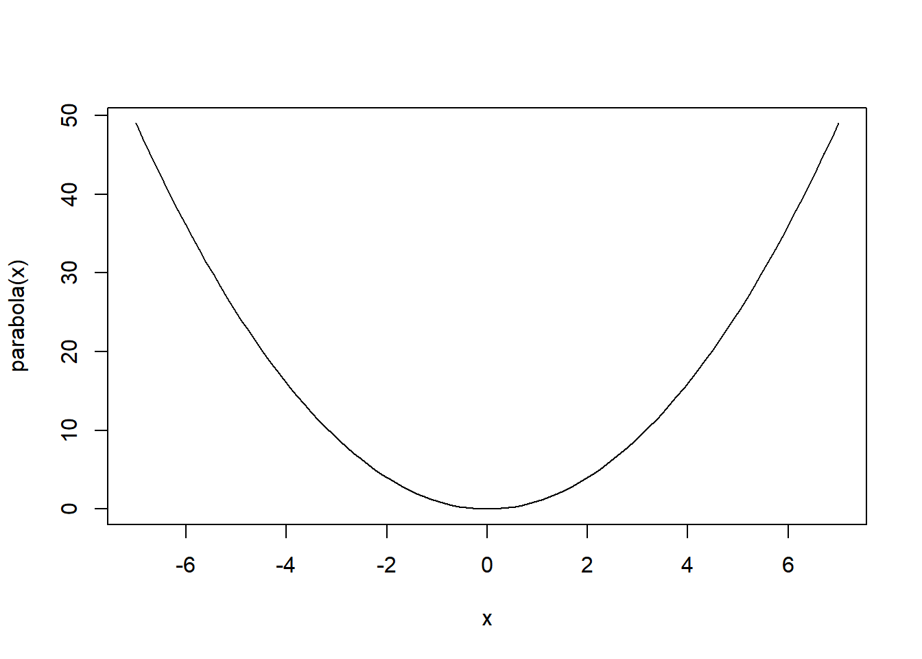
1.7.12.3 How we can add 2 functions in one plot?
Let’s start by introducing a couple of intriguing functions:
norm12 <- function(x) {exp(-((x-1)/2)^2)}
norm22 <- function(x) {exp(-((x-2)/2)^2)}
Can you visualize the shapes of the functions I’ve just defined?
To confirm your visualization, let’s plot them together:
curve(norm12, from = -7, to=7, col='red', ylab = "pmf")
curve(norm22, from = -2, to=7, col='blue', add = TRUE)curve(norm12, from = -7, to=7, col='red', ylab = "pmf")
curve(norm22, from = -2, to=7, col='blue', add = TRUE)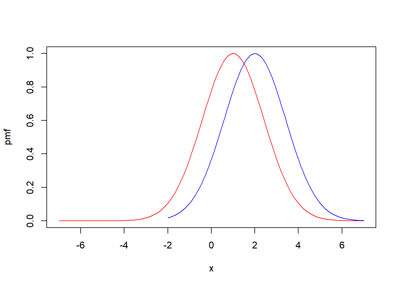
Note: You are free to add as many functions as you need. Simply include the parameter add=TRUE when using the curve() function. This allows you to seamlessly incorporate additional functions into the existing plot.
1.8 Libraries Used in This Book
The following libraries will be utilized throughout this book:
library(RcppAlgos)
library(psych)
library(dplyr)
library(ggplot2)
library(gtools)
library(PerformanceAnalytics)
library(ggcorrplot)
library(htmltools)
library(plotly)
library(gapminder)
library(tidyverse)
library(markdown)
library(quarto)
library(palmerpenguins)
library(caret)
library(randomForest)
By executing the above code chunk, all these libraries will be loaded into memory.
To install the required library, use the following command:
install.packages("nameofLibrary")This command will download and install the “nameofLibrary” package, ensuring you have the latest features and bug fixes. Once the library is installed, you can remove the installation command from your code to avoid unnecessary installations in future runs.
1.9 Recommended Sites to Enhance Your Visualization Skills
There are countless ways to create visualizations, and I encourage you to explore and learn more from the following websites:
- ggplot2.tidyverse.org
- r-graph-gallery.com
- r-coder.com
- sthda.com
- cran.r-project.org
- plotly.com
- r-charts.com
These resources will help you broaden your understanding and proficiency in creating visualizations using R.
References and footnotes
Giorgi, F.M.; Ceraolo, C.; Mercatelli, D. The R Language: An Engine for Bioinformatics and Data Science. Life 2022, 12, 648. https://doi.org/10.3390/life12050648↩︎
or go here: Section A.3 for more information how to install or how access it in the cloud.↩︎
To copy the code, click on the top-right corner of the code block below. Next, paste the copied code into the Console in RStudio, and finally, press Enter to execute the code.↩︎
when creating a dataframe from lists, be sure all list have the same length.↩︎
If you want to know more on data manipulation and transformation, I recommend you to go to chatgpt and ask to give you examples of
data wranglingusing R.↩︎More in depth explanation go to <https://r-coder.com/>↩︎
move your pointer over the plot↩︎
“Daily Diet Composition Calculator: Charts for Carbs, Protein, and Fat.” Verywell Fit, https://www.verywellfit.com/daily-diet-composition-calculator-charts-carbs-protein-fat-3861072↩︎